Tap Into Your Customers’ Primal Decision Process By Leading With Their ‘Why’

Automobile marketers are a savvy bunch.

At its core, their product is a smartly connected collection of metal, plastic, rubber and glass. Vehicles are a utility designed to move us, and our stuff, from point A to B.

What those marketers sell, however, is so much more. 

Take this Jeep ad from 2012, for example.

online Jeep ad

Notice the ad team didn’t spend space telling us about the engine’s horsepower, displacement, or lb-ft of torque. They didn’t detail Jeep’s experience building rugged, off-road vehicles or explain their exacting manufacturing processes.

Instead, they show us what life will be like behind the wheel of our new Jeep. They help us imagine tackling snowy roads and rugged trails with ease. If we buy a Jeep, the ad tells us, life in winter becomes so much better.

So why didn’t those marketers just provide us a list of comparative specifications? Surely that would appeal to our logical brains. And we all make decisions based on logic, don’t we?

That seems, well, logical. But research on the topic tells a different story.

In fact, 95% of our buying decisions are based on emotion. It’s only after we’ve mostly made up our mind that we use logic and comparison to justify that choice.

So that’s what the savvy Jeep marketers did. They lead us to answer the question “why would I buy this” without muddying up the copy by answering “what did we make” or “how did we make it”.

The influence of our ‘why’ is rooted deep in our brains. If you take the time to understand and expose your customers’ why, you’ll jack directly into the center of their decision making process.

Why ‘why’ works: the Golden Circle and the limbic brain

Humans have the largest brain to body-size ratio of any living creature.

We didn’t start out that way, though. Our brains have tripled in size since our earliest humanoid forbearers. What’s really cool is that you can track some of our newer abilities to the most recently added layers of grey matte.

Language, for example, gets processed in the neocortex, the newest and outermost layer. The limbic system sits behind that, is older (evolutionarily speaking), and concerns itself with feelings and emotions. The limbic system is also where we make decisions initially. And that’s why we don’t first make them with logic.

The problem is that the limbic system can’t process language. So it doesn’t do a great job of explaining its decision making process to the more rational parts of your brain. That’s why we call it the subconscious. Incidentally, it also explains why we often have a hard time putting feelings into words.

Simon Sinek, an author and speaker, has created a simple framework to help us think about how we can jack directly into the limbic system. He calls it the Golden Circle.
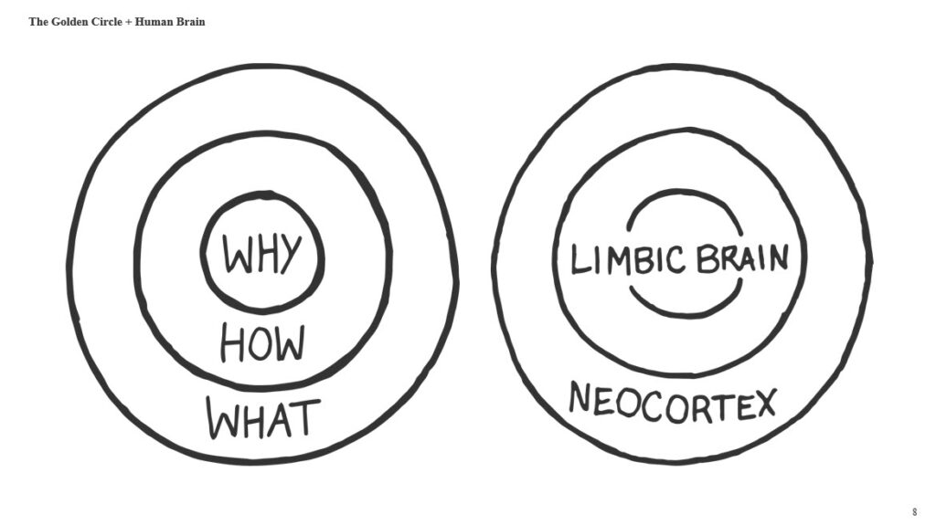
Golden Circle of Human Brain graphic

His framework breaks down messaging into three questions: why, how, and what.

What: product features

How: company values, experience, processes

Why: benefits and outcomes for the customer

Notice that what and how are all about your company and your products.

Why, on the other hand, is customer-centric. It inhabits the same center of the circle as the limbic system because it speaks directly to our decision-making, emotional brain. The why inspires action which will be justified with logic later. It gets us excited thinking about how badass we’ll be gliding through snow drifts that stop lesser vehicles cold.

Answering why before we get to the what and how, according to Sinek’s model, means our communication will more naturally follow the steps we all take to make decisions.

It’s not always easy to do. The first challenge is learning what your customers’ why really is.

Getting to the real ‘why’

Theodore Levitt, a Harvard Marketing Professor, is famously attributed with the quote: 

“No one wants a drill bit. What they want is a hole.”

It’s a keen insight for marketers. It says they should think more about what their products actually do for their customers and less about the features of the products themselves.

But is it true? How many times have you, deep in your subconscious, really wanted a new hole in your wall?

More likely, you wanted the peace of a well-organized space and the new shelf that would get you there. Or you wanted the satisfaction of showing off your DIY project. 

The point, says Marketing guru Seth Godin in his book This is Marketing, is that there may be many different reasons why people buy one product. Your job as the marketer is to know what they are.

“Don’t reverse engineer a why to fit your audience. Understand their real why and create a product, and marketing, to support it.” – Seth Godin, This is Marketing

Your customer’s why, Godin explains, is really the change they seek. What is their problem today and what could be their new reality be if they use your product?

To get there, you’ll use two things:

  • Empathy, one of the most powerful tools in sales and marketing.
  • A tactic from your average preschooler.

We’ve written about empathy before. It’s powerful because it allows us to go beyond our own experiences and understand what change our customers are looking for. Even when they don’t know how to articulate it themselves.

If you’ve ever spent the day with a preschooler, you already know they are unabashed champions of asking why. We’ll use their strategy to learn what change our customers are looking for. 

It goes a little like this:

Why do you want a new vehicle?

I want an SUV with 2nd-row captain’s chairs

Why?

Because I’d like to give my kids their own space

Why?

Because they fuss at each other on road trips.

The real change that’s desired here isn’t actually 2nd-row captain’s chairs. It’s a peaceful road trip.

Likely, other parents would be interested in the same change but haven’t considered how to achieve it. You can use this insight to guide your copy.

“Individual seats for them. A peaceful roadtrip for you”

For a harried parent, a peaceful roadtrip probably sounds like a pretty good idea.

Conclusion

Humans make decisions in our subconscious, limbic brain first and then use our logical neocortex to justify those choices.

In short, people don’t buy what you make or how you make it. They buy what your products will do for them. 

As marketers, our job is to uncover the why that will motivate action. Then build website copy, advertisements and other customer-facing communications around it.

As Seth Godin says: “Don’t begin with your machines, your inventory, or your tactics. Don’t begin with what you know how to do or some sort of distraction about your mission. Instead, begin with the dreams and fears, hopes and emotional stakes, and with the change your customers seek.”
If you’re ready to create the kind of customer-centric website that will motivate your audience to take action, contact us today and let’s get started.

Conversion Rate Optimization Best Practices In 2020

The cost and challenge of getting someone to visit your website has ballooned over the last few years.

If you’re using Facebook ads to attract traffic, for example, the average cost for a click (CPC) from that platform has jumped as much as 171% year over year. And Google Ads have more than doubled from just a few years ago. 

Even organic search, with its ‘no-click’ results and competitive keywords, has become a tough field on which to play. 

That trajectory is not likely to change any time soon.

So if it’s more costly to get people “in the door”, then it’s more important than ever that you increase the number of visitors that buy. Even a little boost can make a big difference.

Let’s say your average order value (AOV) is $500 and you have 1,000 unique monthly visitors to your website. A 1% increase in buyers will net you an extra $5,000 a month in sales.

Not too shabby. And the best part? You may be able to get that $5k/month boost with a few minutes of effort and zero extra marketing dollars.

How you do it is the crux of conversion rate optimization (CRO). 

Because of its impact on revenue, CRO has become an entire field of study unto itself. Here we’ll cover the basics and offer eight best practices you can start right now to boost your website conversions.

What is Conversion Rate Optimization?

Let’s break this down.

On your website, a conversion is when someone takes a desired action.

Sure, the biggie here is making a purchase or scheduling an appointment or demo. That’s your macro conversion.

But that’s the final step of a marathon. Or maybe a sprint if things are going really well. 

Before that macro conversion happens, there are likely multiple micro conversions. While not as exciting as getting a new order, those micro conversions are important to nail.

Why? Because most people visit a website multiple times before making a purchase. In fact, a study by Episerver revealed that a whopping 92% of people visit a website the first time to do something other than make a purchase. Micro conversions keep them moving through your sales process, even if it’s over the course of several website visits.

Here are some examples of micro conversions you’ll want to consider:

  • Reading an article on your blog (and another, and another…)
  • Subscribing to your newsletter
  • Adding a product to a cart
  • Reviewing technical specifications or product pages
  • Viewing a video
  • Downloading an ebook or other educational material

Conversion Rate is just the percentage of people visiting your website that do something you want them to do. 

Calculating conversion rate is straightforward:

Conversion Rate Equation

Just as it sounds, Conversion Rate Optimization is maximizing the number of conversions you get from a pool of website visits.

Wikipedia offers a more detailed definition: 

“Conversion rate optimization (CRO) is a system for increasing the percentage of visitors to a website that convert into customers,or more generally, take any desired action on a webpage. It is commonly referred to as CRO.”

8 conversion rate optimization best practices

Increasing conversion rate, even a little bit, can have a significant impact on your revenue. Here are 8 best practices you can use to begin boosting website conversions, and revenue, right now. 

1. Make your CTAs very specific

A call to action (CTA) is copy that requests an immediate response from your website visitors. They may lead to a macro conversion like “buy now” or a micro conversion like “learn more”. CTA copy may include the words on the actual button as well those immediately around it.

CTAs are incredibly important to conversion, so our first four CRO best practices are all about making them great.

And the first way to do it is to create very specific CTAs. Your CTA copy should tell the reader exactly what to expect.

For example, instead of “Read On”, consider, “Download the full guide now for free”. Instead of “Get started”, try “Start your 14-day trial now”.

2. Eliminate fear in your CTA

Fear is a significant deterrent to taking action. Your CTA copy should ease your customers’ most common fears.

If you offer a subscription service, include the copy “30-day money-back guarantee” in your CTA. If you offer a free trial, add “no credit card needed” below your “Start your 14-day free trial” button.

3. Make your CTA stand out

Since your CTA is the most important element of your landing page, it deserves some special treatment to get all eyes on it.

To get there:

  • Use a contrasting color that is reserved only for your CTA.
  • Surround your CTA with plenty of whitespace so it stands out

4. Make your CTA a button (not a standard link)

We humans are hardwired to recognize patterns and understand repetitive processes. Buttons have become the standard for CTAs. So while escaping the box of sameness is great in many areas, this is not one of them.

Look over this example CTA from the Matcha, which includes all four of these elements:

matcha website screenshot

5. Make your headline crystal clear

Now that your CTAs are highly tuned tools of conversion, let’s look at the copy on your landing page.

Ideally, you want a website visitor to know three things within 10 seconds of landing on your website:

  • What you do
  • Who you do it for
  • Why it’s useful for them

Your headline is where this happens. The tendency in your headline is to be clever or to try and boil everything down to three words.

Avoid that temptation.

Clever and concise copy is a great thing, but not if it leaves your visitor wondering what the heck you actually do. Or why they should care. Remember, simplicity sells!

6. Add social proof

Until they really get to know you, people will trust other people more than your business. That’s a powerful fact you can leverage by adding social proof to your landing page. 

Social proof can come in many forms. The most obvious is customer testimonials. If possible, add customer names, titles, company names, and a photo; the more detail you provide the more relatable that testimonial will be.

Another powerful form of social proof is based on the “Wisdom of Crowds” theory. Basically, when humans see a lot of people doing something, they’re more confident in doing it themselves.  

Use numbers here and be specific. If you have an impressive customer base, let your website visitors know that “26,153 recruiters find more talent faster with our software.”

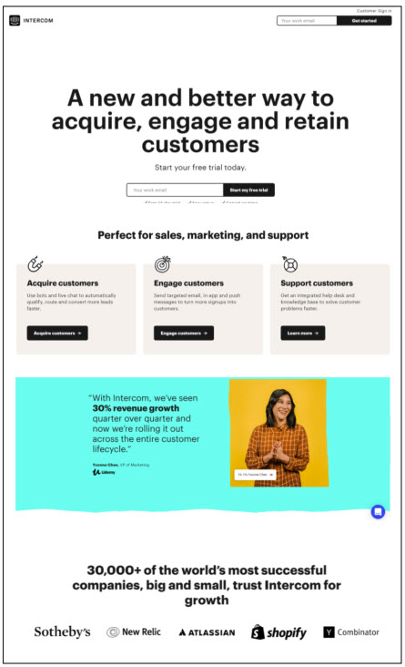
Finally, if you sell to other businesses, don’t be shy about name dropping. Add logos of those companies that are most relevant to your target customer right on your homepage. 

Here’s an example from Marketo. Their landing page quickly explains the benefit of what they do and who it is for. They’ve also included multiple types of social proof.

markeeto website screenshot

7. Create authentic urgency

If you only have 10 of that new product left, let your visitor know. If you’re ending a free trial or only accepting five new clients, say it. Urgency is an incredible motivator to take action.

Another great place to use urgency is around holidays. Holiday sales have a natural expiration date. 

But make sure the urgency you promote is authentic. DO NOT put up a bogus 24-hour countdown timer that continually resets. People will associate your brand with fakeness. 

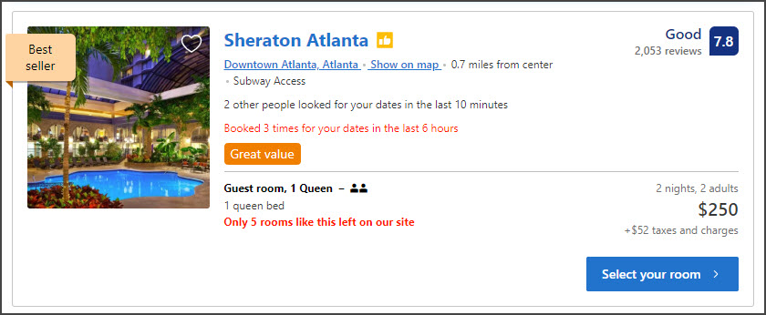
Booking.com might just be the champion of creating a sense of urgency. Look at this listing for a hotel room in Atlanta. Not only do they tell you there are only five rooms left, but they let you know that three rooms were booked in just the last six hours. Better hurry!

Booking.com screenshot

8. Make your contact details easy to find

Our last best practice is the simplest. Maybe that’s why it’s also often overlooked. 

Some percentage of your website visitors are ready to take the next step and call or email you. Can they do it without friction?

If you do business in person, make 100% sure your contact details, or at least a clear link to them, are easy to find on your home page. If it’s possible to text on your contact number, say so. People are often more willing to send a text than call. 

If you only do business online, like an ecommerce store, you should still have a contact page that’s readily available. It shortens the distance between your company and your customer.


Getting people to your website is an increasingly costly and challenging endeavor. If you’re not optimizing the conversion rate of those visitors, you’re leaving serious cash on the table.

You may be able to boost your conversion rate and increase revenue, with a few simple best practices. 
Of course, there are a hundred other tactics you can use to get more people to take the next step. And we’ve worked with them all. So when you’re ready to take CRO to the next level, contact us and we’ll show you how.

Is Your Website Recruiting or Repelling Your Best Job Candidates?

Your website is the digital front door to your company. But it’s not just customers that are stopping in to have a look around. Your next best employee is, too.

“Research by Monster finds the younger generation reacts strongly to what they find on an employer’s website when looking for work.” – computerweekly.com

Is your website a tool for recruiting talent? Or is it chasing away top candidates?

If you’re not sure, that’s OK. We have some great news.

You know those killer marketing strategies you’ve used to convert traffic to customers on your website? They also work to make your site a powerful tool for talent recruitment.

You just need to tweak them a bit for an audience of job seekers. 

Here we’ve compiled a list of seven proven marketing strategies you can use to turn your website into a talent acquisition machine.

And as a bonus, applying these tactics might just help you convert more customers, too.

7 Ways to Turn Your Website Into Your Best Talent Recruitment Tool

Whether you rely on your website directly for sales or not, it still matters. In fact, 75% of customers admit to making judgments of a company’s credibility based on website design.

Well, the same holds for someone looking for their next career move. 

So if nothing else, you should at least make your website clean, modern, and well organized. It could mean the difference between attracting the people that will help your company grow, or chasing them into the arms of your competitors.

(Don’t forget that website copy is an important part of design)

With general website housekeeping complete, you can begin to use these easy talent recruitment strategies.

Don’t worry about tackling them all at once. Pick a couple that fit your company and current capabilities. Then expand from there.

Strategy #1: Create applicant personas

When you want to guide someone to a conclusion — in this case, that your company is a great place to work — it helps to first imagine the person you’re guiding. 

For example, a mid-level manager is likely in a different stage of life than an entry-level associate. Of course, both will want competitive pay.

But what else? 

One may be thinking about family leave benefits while the other wants a job close to a commuter train stop.

What else makes your ideal candidate tick? Are they super-techy? Or would collaborating with creatives get their gears going?

With that in mind, paint a mental image of this person — their education, work experience, hobbies, and so on. Then create a simple persona.

Marketing teams have done this for years to make their messaging more compelling. Once you have a persona for your ideal candidate, your recruitment messages will be more compelling, too.

Strategy #2: Improve the talent “conversion rate” of your website

In marketing, conversion rate optimization (CRO) is the process of increasing the percentage of website visitors that take an action like placing an order or scheduling an appointment.

In the case of talent acquisition, you want people to apply for a job.

One thing that will destroy your hiring conversion rate is a difficult application process.

Here are a few tips to make it a smooth flow from the first click to a completed application:

  • Make the entire process mobile-friendly
  • Provide an easy way to add a cover letter
  • Make any forms responsive  

Not sure how to make a responsive form mobile friendly? Let’s talk!

Strategy #3: Provide testimonials

According to a survey by BrightLocal, 88% of people trust online reviews written by other consumers.

You can leverage the power of recommendation for your hiring process by including employee testimonials. Videos would be great here, but brief written endorsements will work, too. Always include a photo of the employee, though. It will help with credibility and engagement.

Don’t forget to consider the persona you created and use current employees that will be most relevant to the position you’re hiring for.

Strategy #4: Create a “day in the life” video

One important goal of marketing is to help customers imagine what life will be like once they start using their new product or service.

A day in the life video is an incredible way to help job seekers imagine themselves in their new role. It doesn’t have to be highly produced. Walk the floor with an iPhone, say “hi” to a few coworkers, and talk about the exciting work your firm is doing.

Include shots of any great amenities — like the neighborhood vibe or state-of-the-art tech the applicant will have access to. 

A gallery of still images is also a possibility, but video is more powerful. 

Strategy #5: Create a killer About Us page

Your About Us page is the best place to expose your company culture, mission, and success. It gives potential customers a chance to know what kind of people they’re about to do business with. 

For job seekers, it might be even more important. 

Linkedin found that 64.7% of job seekers say that not knowing, or disagreeing with, a company’s mission, values, or purpose is a deal-breaker when considering a future employer.

Your About Us page should answer:

  • What problems are we solving and for who?
  • Why do we believe this is an important mission?
  • How have we been recognized for our work?

While humility is often an admirable quality, this is not the place for it. Be loud and proud about the awards you’ve won and your company’s growth. 

People want to know they’re working for a company that’s changing the world, even if it’s for one person at a time.

Strategy #6: Create an irresistible CTA

A call to action (CTA) is the pointy tip of your marketing spear. It’s the most direct ask of your customers (think: “click here”, “book now”, or “add to cart”).

Your ask of job seekers might simply be “apply now”. Or it can be much more.

Here are some ways to write strong CTAs.

  • Give your CTA some space, don’t hide it in the middle of other text.
  • Make it clear how and why to apply (prioritize clarity over cleverness).
  • Use verbs that elicit action and avoid weak phrasing.
  • Make it personal.
  • Make the reader feel safe.

For example, let’s say you’re a salon looking for new stylists. Your CTA might go something like this:

Apply now and join us in the war on bad haircuts

(and rest assured, your information will not be shared!)

Strategy #7: Use an email autoresponder to confirm receipt of applications

For most companies who use email marketing, order confirmation emails have the highest open and engagement rates. That’s because customers expect them and they hold valuable information.

For savvy marketers, this is a golden opportunity to include other links to content and promotions. 

Use this same strategy to engage your new applicants. Send a thank you email with some “next steps” information. Then add links to your social media pages, relevant blog posts, About Us page, and newsletter subscription page. 

It’s likely that this candidate is applying for multiple jobs. Your thank you email is a chance to prove that you have the best opportunity for them.

Conclusion

In an employee market, where available jobs outnumber skilled workers in some areas, finding talent is difficult.

Finding the right talent to match your company culture? Well, that can feel impossible.

Marketers have been working on attracting a qualified audience for a long time. Rip a few pages from their playbook and you’ll make your website a talent acquisition machine.

Of course, if your website hasn’t been updated in a while you will have a much more difficult time meeting your next rockstar employee. 
Give us a call and we’ll show you how to make your site the best salesperson, and recruiter, you’ve ever had.

What You Need to Know About ADA Compliance For Your Website

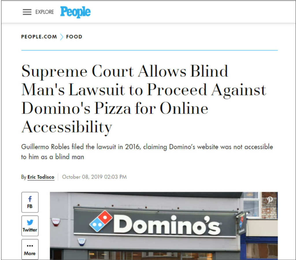
In 2016, Guillermo Robles sued Domino’s after unsuccessful attempts to order a pizza from the national restaurant chain’s website. Robles, who is sight impaired, couldn’t complete his order despite using screen reading software.

screenshot of ada lawsuit of dominos pizza

The case is now in the hands of the Supreme Court, it’s outcome potentially influencing how websites are designed in the future. 

But it is not a singular event. Reebok, the NBA, and Target have all been named in similar suits. In fact, more than 2,200 website accessibility lawsuits were filed in 2018.

At the crux of each is Title III of the American’s with Disabilities Act (ADA). The Act states that all “places of public accommodation” should be made accessible to people with disabilities. 

Plaintiffs claim that access to places of public accommodation applies to websites. Defendants cite the lack of formal regulations from the U.S. Department of Justice (DOJ) — the body tasked with enforcing the ADA.

In the wake of this litigation hornet’s nest are confused and concerned business owners and a group of companies looking to exploit their fear. 

screenshot of email on ada scare tactic.

(caption: Businesses owners are finding cold outreach emails like this one a common occurrence in their inbox.)

With a news feed full of high-profile lawsuits and an inbox full of dire warnings, you might find yourself a bit nervous about your own exposure. 

But should you be?

And if not, why bother investing in website accessibility features?

In this article, we’ll show you how to determine if your business is a likely target for litigation based on the trend in court decisions.

We’ll also reveal why an accessible website is a good idea even if you’re not likely to be sued.

And finally, we’ll give you seven tips to help make your website easier to access by potential customers with disabilities.

A little disclaimer before we dig in. This article is not a replacement for professional legal advice. If you have a specific legal question about ADA website accessibility, please consult a qualified lawyer.

Now, let’s get to it. 

Is your website a target for accessibility lawsuits?

Your business is likely subject to ADA compliance if you have more than 15 employees (Title I) or can be considered a place of public accommodation (Title III). 

But does this requirement extend to your website?

In the void of a clear definition from the DOJ, we look to relevant court decisions for guidance. 

Consider the case of Gil vs. Winn Dixie

In June of 2017, Juan Carlos Gil — who is blind — won a lawsuit against the grocery store chain Winn Dixie. Gil said he was not able to use Winn Dixie’s website to find store locations, download coupons, and order prescriptions online.

The last complaint was particularly influential. 

Because he couldn’t do it online, Gil had to order his medications out loud at the store’s counter. Since other people within earshot could hear his order, Gil’s lawyers pointed to a potential HIPPA violation. This is something sighted people ordering prescriptions at Winn Dixie would not have to worry about.

The Winn Dixie case is typically considered the first of it’s kind to go to trial. And understanding the judgement is important for businesses that are assessing their own vulnerability.

So why did Winn Dixie lose?

First, even with a website reader, Gil was not able to access all of the features on the company’s website. So it was clear that Winn Dixie’s website was not usable by at least some dissabled population. 

Second, the judge overseeing the case determined that Winn Dixie’s website is heavily integrated with their physical store. The site provides ways to search and buy products, plus communicate with store staff in unique ways. Therefore, the court determined the website is a place of public accommodation and should be subject to ADA compliance.

So far, most courts hearing such cases have followed these criteria. 

Conversely, websites that are not connected to physical locations, like Facebook for example, are not yet in litigation crosshares.

Additionally, business websites that provide information only and no access to goods or services, even if those businesses have physical locations, haven’t been considered as places of public accommodation by the courts so far.

It’s also interesting to note that as of January, 2019, there were over 1.5 billion active websites globally. Even with compliance lawsuits on the rise, the number of businesses that will be sued is relatively miniscule. 

If the odds of being named in an ADA lawsuit are so small, should you consider investing in accessibility features for your website?

Why you should invest in an accessible website?

No one likes the idea of being sued. But there’s a much better motivation to make sure your website is as accessible to as many people as possible: It’s just good business.

In a 2017 survey, nearly 27 million American adults 18 years and older reported experiencing vision loss.

Roughly 3.7 million American adults 18 years and older report some trouble hearing.

Of course, some in those groups will overlap. But the fact is, if you invest in making your website more accessible, you will open the doors to a huge new population of buyers.

But if there are no formal regulations to guide you, how do you know what to do?

How to make your website more accessible

Before anything gets too complicated, remember this. The best website designs connect quickly with visitors and make it easy for them to take action.  That theme should be your guide as you consider how people with disabilities access your website.

Now, even though there isn’t a set of rules from the DOJ, most courts are pointing to an international set of standards called the Website Content Accessibility Guidelines (WCAG). 

And that’s your first step.

Step 1: Review the most recent guidelines, WCAG 2.0.

This resource explains the terms and actions involved in making a website WCAG 2.0 compliant. It also offers examples to make each point more clear.

Step 2: Test your current website

WAVE is a free online tool for you to test the accessibility of your site. It’s really easy to use. Just enter a URL and it creates a visual report. While WAVE is based on WCAG, it also goes beyond the guidelines and considers the humans that will use your website.

Step 3: Add descriptive Alt tags to your images

This is one of the most important, and easiest, steps to take. 

Alt text makes it possible for screen readers to describe images a sight-impared person cannot see. They don’t have to be super detailed. Just make sure they’re giving your website visitor an idea of what’s happening in the image.

Step 4: Choose easy to read fonts

This is another really easy way to improve your website experience for a broader set of visitors. 

Choose font styles that are easy to read. Also, make sure you keep a good color contrast between your fonts and their backgrounds (e.g. don’t use a light colored font on a light colored background).

Step 5: Make your site completely operable by keyboard

Not everyone can interact with a touch screen or use a mouse. Every action, from progressing through screens to playing a video, should be able to be done on a keyboard.

Step 6: Make your site accessible to an assistive reader

This one is probably for your developer/designer. 

To get there, your site should use standard HTML tags, have text-only documents available, and use CSS best practices. If you have questions about this one, contact us. It’s what we do. 

Step 7: Make forms easy to understand and fill

Completing a form, like at checkout for example, can be a major hurdle for someone with dyslexia or a sight impediment. 

Make sure your forms auto fill properly whenever possible. Also, each input should be clearly marked so accessibility devices can do their job.


ADA compliance website lawsuits are on the rise. And there’s no sign of legal guidelines from the DOJ in sight.

But that shouldn’t cause panic. The truth is, your business is very unlikely to be a litigation target. 

There are, however, more compelling reasons to make your website accessible. Namely, opening the digital door to a large population of new customers.

Making your website the most powerful sales tool you have is our businesses. If you have questions about how to do that for people with disabilities, contact us today and we’ll talk you through the answers.

20 Marketing Tools your Small Business Needs

Digital marketing for a small business is a wild, wonderful world. 

Social media, email, and search engines have knocked down almost every wall between business owners and their customers.

But it’s not all upside.

Managing all those channels adds a whole new burden on time and resource-strapped teams. 

Luckily there are plenty of smart technology companies out there who saw this challenge. They’ve developed some pretty amazing marketing tools sized, and priced, for small businesses.

Some are light versions of enterprise applications. Some are designed solely to serve the small business market. 

We’ve pulled 20 of our favorites together. No matter your digital marketing challenge, there’s likely something here to help you do it better, faster, or cheaper.

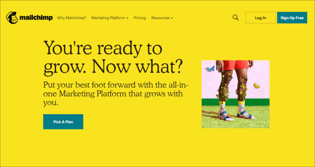
Mail Chimp

MailChimp

Mailchimp began as a platform to make email marketing easier. And if you just want to automate your newsletter, it’ll help you do that. 

But they’ve evolved into a multi-channel marketing solution that helps you segment audiences, manage social media, create content, contextualize results, and more. 

They have a free version that will help you get started. And their Essential’s plan is just $9.99 a month.
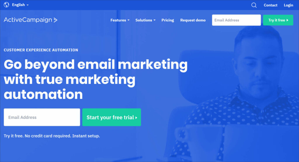
Active Campaign

Active Campaign

Email marketing continues to net extraordinary returns for small businesses. But the tasks involved can consume a lot of time. 

ActiveCampaign automates those tasks so every-size business can leverage the power of email marketing. 

Their pricing starts at $9 / month which includes free migration from other email marketing platforms. They also offer a free, no-credit card trial. 

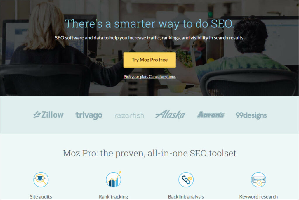
Moz

Moz

Search engines are like modern-day mall directories. That is if shoppers only ever looked at the first seven listings and the mall constantly changed the rules on how to rank on their directory.

Moz makes it really easy for businesses, big and small to rank on search engine pages. The platform answers questions like “which keywords should I target” and “how is my site ranking for these keywords?”

Moz offers two programs. Moz pro is suited for businesses that cover a large geographic area (or are not bound to geographies at all). Moz Local is for businesses challenged with ranking well on local geographic searches (think “who is the best dentist in Denver?”).

Pricing starts at $99 for Pro and $129 (per location) for Moz local. 

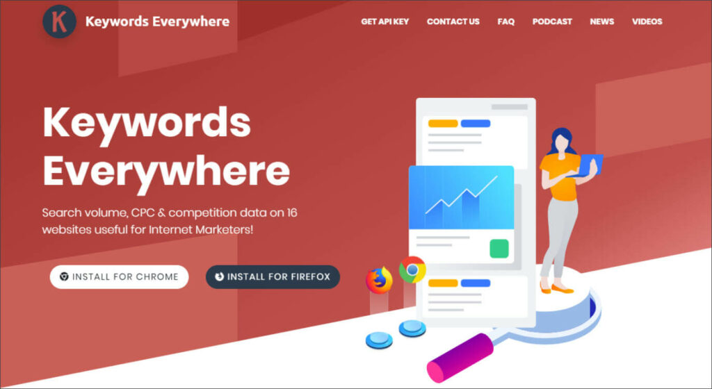
Keywords Everywhere

Keywords Everywhere

Just knowing which keywords are heavily searched and how difficult it can be to rank for them is a great start for SEO.

Keywords Everwhere is a free Chrome plug-in that shows search volume, competition rating, and alternative search terms for every search you enter. 

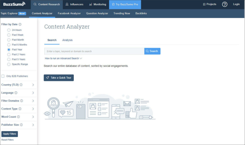
BuzzSumo

BuzzSumo

Along with search engines, social media platforms are the second half of the one-two punch of online traffic. 

BuzzSumo helps you understand which content will drive the most engagement from social media. You can track which pieces of yours have had the most likes and shares from Facebook, Instagram, and Twitter. You can also see what’s successful for your competitors and what content is popular for specific topics. 

You can use a very limited version of BuzzSumo for free. But to get the real benefit, you’ll need at least their basic-level Pro plan for $79/mo. 

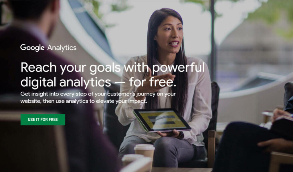
Google Analytics

Google Analytics

ROAS, CPA, ROI. Google Analytics helps you make sense of the marketing alphabet soup.

In Analytics, you can understand which pages are driving the most traffic, which Google Ads are performing, and make smarter marketing decisions based on data. 

The best part is that Google Analytics is free without limitations. 

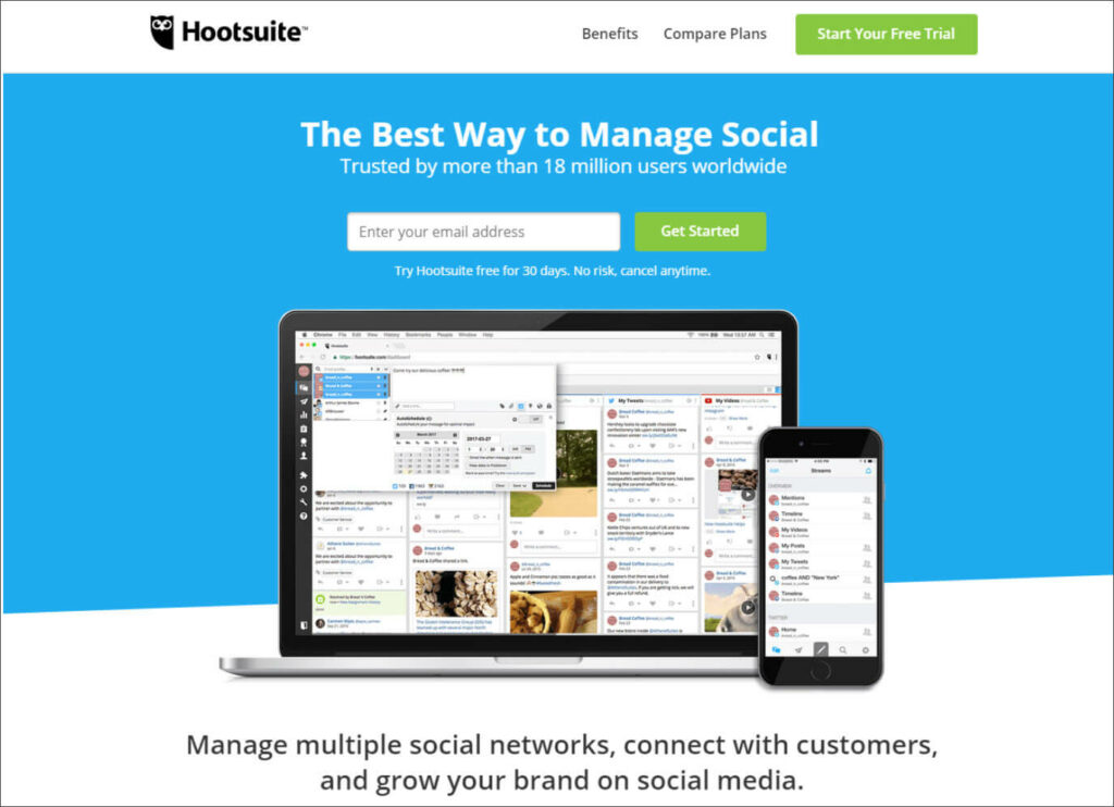
Hootsuite

Hootsuite

To stay relevant on social media, you need to post content frequently, respond to your audience, and track success. A nearly impossible task for most small businesses.

Hootsuite levels-up the impact a small marketing team can have on social media. From their platform, you can schedule all social posts, reply to comments with a single click, and visualize all your data in one place. 

Plans start at $29 / mo and increase with the number of users and social media profiles. 

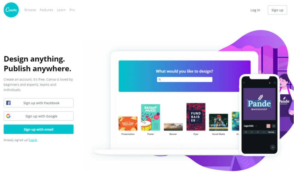
Canva

Canva

Using a design pro is always a great idea. But sometimes there are some small design jobs you can tackle. That is, with a little help. 

Canva helps non-designers and design pros alike create beautiful marketing assets. The platform offers a large library of images, design templates, and collaboration and organization tools. 

Their plan costs $12.95/mo if paid monthly, $9.95/mo if paid yearly.

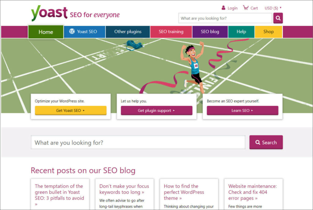
Yoast

Yoast

The Yoast plug-in is basically an online SEO expert that reviews your content and pages for all the major search engine ranking factors. The plug-in looks at optimal keyword use in content, makes sure search engines index your site properly, checks for outdated or duplicate content, and offers link suggestions.

Yoast has a basic free version and a more robust version for a one-time fee of $89.

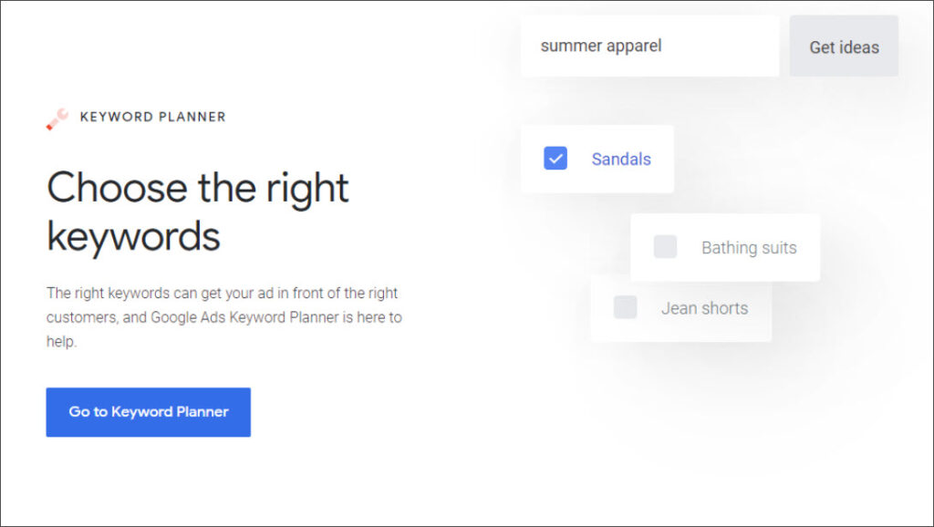
Google Keyword Planner

Google Keyword Planner

Straight from the horses’ mouth, Google Keyword Planner tells you which search keywords and terms people use to find businesses like yours. Then you can get bid estimates and apply those keywords directly to your Google advertising plan.

Google Keyword Planner is free. 

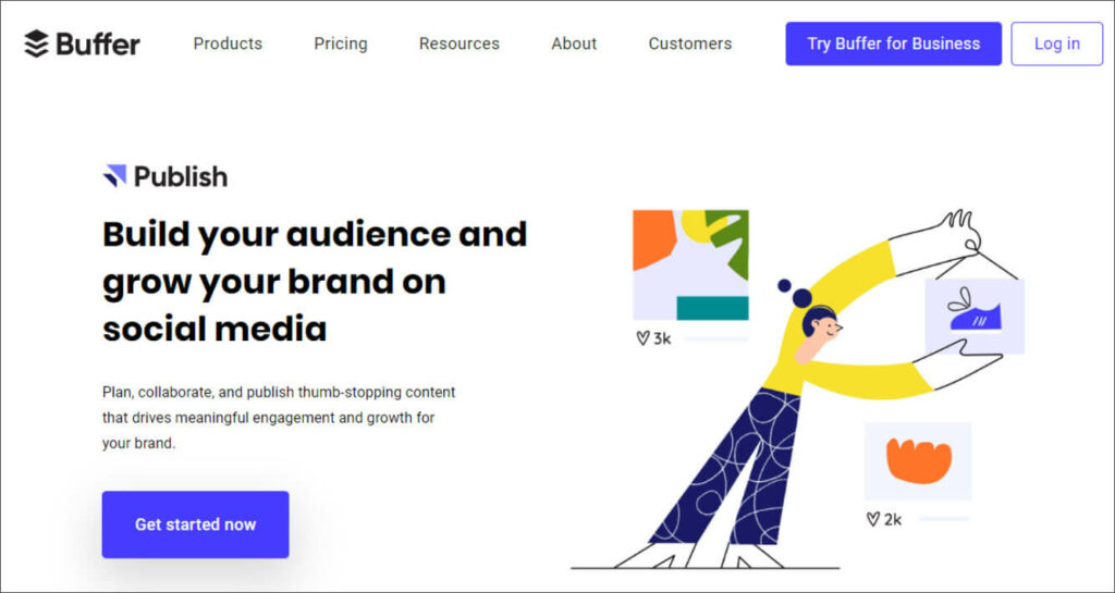
Buffer

Buffer

Buffer solves most of the same social media management challenges as Hootsuite, but their basic package is more budget-friendly (and a little more ‘bare bones’). Their entry-level plan is $15 / mo. 

One notable difference is that Buffer doesn’t offer paid social media post management, while Hootesuite does. 

If you have a very small team and aren’t planning on running several paid social media ads soon, Buffer is a good choice. 

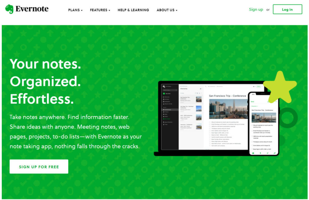
Evernote

Evernote

Say you’re reading a blog post about useful online marketing tools. One catches your fancy and you want to remember it. What do you do?

Why, you put it in Evernote, of course. 

Evernote is a super useful tool for capturing and organizing random thoughts, to do lists, voice memos, photos, and more. 

Their Basic plan is free and the Premium plan is only $7.99/mo.

SurveyMonkey

Survey Monkey

Want to know what your customers think of this season’s colorway? Think your company meetings would be more useful if you had some employee feedback?

SurveyMonkey is designed to make gathering real-life feedback easy. 

The free version is plenty enough for most simple surveys. If you have a lot of potential respondents, need to coordinate with a team, or require more analytics, their paid programs start at $25.

Siteliner

Siteliner

Siteliner is a simple, free tool that provides a lot of data about your website quickly.

Just enter your URL and in a minute or so you’ll know things like average page speed, number of links per page, and how much of your content is considered duplicate.

Siteliner also tells you the averages for other sites like yours so you have a benchmark to work against. 

HARO

Haro

HARO (Help a Reporter Out) connects journalists with sources and vice versa. 

Are you an expert on interior paint colors? Or do you know everything there is to know about back-end accounts payable?

Register as a source and journalists will reach out when they need your expertise. Then, you can give a quote and your contact details for some free and easy exposure. It’s Public relations made simple. 

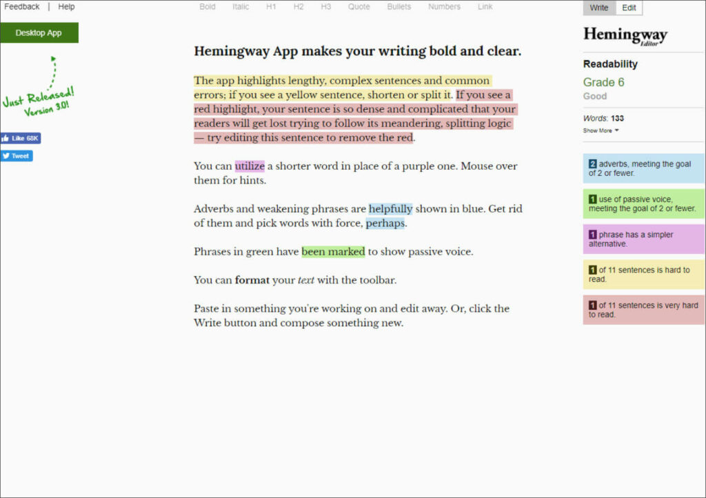
Hemingway App

Hemingway App

Your customer-facing copy should be clear and concise. But sometimes we’re too close to our own words to edit well.

Enter the Hemingway App. This free tool provides notes on any copy you paste into it. With you, you’ll find places to cut frivolous words and eliminate the dreaded passive voice. 

Coschedule Headline Analyzer

CoSchedule Headline Analyzer

Just enter your headline into Coschedule’s Headline Analyzer and watch the magic. The nearly instant report asses headline length, proper use of power and emotional words, and how your headline will appear on email and Google. 

The Headline Analyzer is free but requires you to input contact details before your first use. 

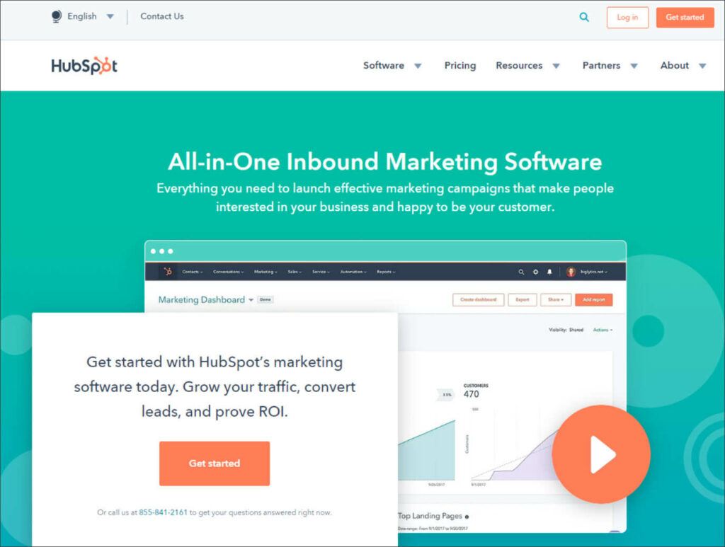
Hubspot

Hubspot

Hubspot’s claim to fame is inbound marketing. While they’ve grown to offer contact and customer management, they still have one of the most robust platforms for driving traffic and converting visitors to shoppers and shoppers to buyers.

At $800 / mo the paid plan is a bit steep for most small businesses. But Hubspot offers a free marketing tool pack that’s pretty useful for small teams.

TweetDeck

TweetDeck

TweetDeck is a free tool that helps you organize and track your activity on twitter. You can see what’s trending for your topics and have your tweets and messages in an easy to search format. 

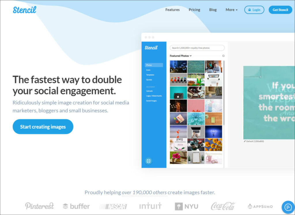
Stencil

Stencil

Images fuel engagement on social media. That’s obviously true for Instagram and Pinterest, but it’s also relevant for Twitter and Facebook. 

If you need one or two images, free platforms like Unsplash are great options.

But if you pull loads of pics for a variety of platforms, paying a monthly fee for Stenil could be worthwhile. 

Not only does Stencil have a huge catalog of royalty and credit-free images and over two million icons, they have a list of tools to make their use easier and more powerful. 

For example, each image has a list of pre-set sizes designed for major social media platforms. And you can schedule your Stencil image posts directly through Buffer. 

Stencil offers a basic plan for free, but unlocking more images and features is only $9/mo. You can get the unlimited version for $12/mo.


Digital marketing platforms have given small businesses a more direct connection to their audience then they’ve ever had before. But they also add a lot of time burden on those small teams.

Marketing technology companies are addressing these unique challenges with lighter versions of enterprise applications or whole new products designed for small businesses.

No matter how many tools are in your marketing “stack,” there’s no replacement for the creativity and human focus of a dedicated team. When it’s time to create your next great website or fill it with copy that grows your business, set aside some time to chat with us.

The Power of Empathetic Website Copy and Content

You can learn all you need to know about empathy from a belly flop.

Picture it: a nervous kid inches his way towards the edge of the diving board. He gathers up his courage, takes a small bounce, and launches off. He tries to rotate towards a full flip but fails. In a moment of panic his arms and legs stretch out. Then…

Slap! 

Just as his exposed tummy hits the water, you cringe and gasp a puff of air on pure reflex. 

That ability to feel someone else’s pain, or joy, or frustration, like it was our own is empathy.

As marketers and business owners, empathy is where all communication should begin. This is especially true of marketing copy and content. Why? Because we likely haven’t met the people reading it. So we need to let them know we understand what their hell looks like and that we have the promised land they’re looking for.

Here’s the tricky part.

Writing with empathy means putting our audiences needs ahead of our own. Put another way, it means writing to the psychological benefits of our solutions, not to the features of them. 

Also, writing with empathy means digging deep to learn what those real psychological benefits are. It’s not always easy, particularly when you can’t have a one-on-one conversation with your audience.

There is good news. While empathy is a biological response for most of us, it’s also a skill that we can sharpen over time. 

“Empathy is a skill like any other human skill. If you get a chance to practice, you can get better at it.” 

– Professor Simon Baron Cohen

Here’s how to get started writing content and copy that will quickly connect with your audience and have them seeking your solutions to their pain. 

How to Write Empathetic Copy

There are two steps to writing more empathetic copy:

  • Understand your customers psychological pain
  • Writing to that pain

It seems simple. And it sort of is. As always, the devil is in the details. 

Let’s unpack these two steps into actionable tasks.

A quick note: If you’re not creating your own copy, make sure you work with a team that is willing to understand you and your customers. 

Understanding your customers’ real problem

The basis of empathy is understanding. The challenge for marketers and business owners is that we often don’t deal with the same problems as our customers.

For example, you might sell software that helps accounts payable professionals streamline their process. Your challenges are building a good product and selling it. You may have never had to work a month-end weekend to keep payables on track.

Here are a few things you can do to relate to your audience.

Task 1: create customer personas (and don’t forget the pain)

You’ve likely heard of marketing personas before. Maybe you’ve even created them. In case you haven’t, here’s a quick overview.

A persona is a fictional character you create based on common audience characteristics. Think: how old are my customers? What is their job title? Where do they go for professional education? 

That sort of thing.

You can give them silly names like Suzy Sales Professional or Alan the Accountant. 

These are all helpful when deciding how you’ll write copy. For example, you’ll likely use different language If you’re trying to connect with a 25-year-old entrepreneur versus a 50-year-old work-from-home dad.

But where things can get really juicy is when you drill down to that persona’s psychological pain.  To get there, try thinking like a curious three-year-old. 

Let’s go back to our accounts payable software. 

In this case, you’re writing copy specifically for the ground level employee that would use it, not the executive. Start asking questions.

Why does your software matter?

Because it reduces the number of manual tasks in AP.

Why does that matter?

Because it saves time.

Why does that matter?

Because I can get more work done quickly.

Why does that matter?

Because I won’t have to work weekends to clear month-end AP.

Visualize that for a second. You’re sitting in an office on Saturday afternoon while your kids are at little league. That just sucks!

Boom! There’s your real benefit. Not the cool automation features or even time savings. Your software can actually improve the quality of your customers’ lives by giving them back time to do what they love. Unless they really love doing manual AP tasks, that is.

Sure, you’ll expose the fancy features that get your audience in that happy place. But you’ll want to lead with why it matters

You may also have created a persona for the executive that will sign the contract to buy your product. They’ll have a different psychological pain. So you’ll want to run through the same question process for them. It might end with a reduction in overtime pay or uncorking a bottleneck that has stifled business growth.

Task 2: stalk your audience (in the nicest way possible) 

The internet has created communities at a scale never before imagined. If you collect rare, 1960’s Matchbox cars, you’ll probably find an online community of like-minded collectors that share your passion. 

These communities are a gold mine for marketers and business owners to understand their audience. 

Just Google ‘online communities for accounts payable professionals’ and see how many there are. You can find them on Facebook and Linkedin or on communication platforms like Slack. 

Join these groups and see what questions they’re asking each other. You’ll find a rich vein of content topics to write about and the right vocabulary for your copy.

But remember, you’re in learning mode, not selling mode. If you go in sales-guns-ablazin’, you’ll likely find yourself escorted out of the group. 

With a great understanding how what your audience’s pain is and how they talk about it, you’re ready to create some empathetic copy that speaks to it. 

Write ‘you’ focused, benefit-centric copy

Task 1: Forget feature-focused copy

It hurts a little to hear it, but no one cares that your socks have space-age, titanium wrapped fibers. They care that they get fewer blisters when they run. Even better, they care that they can run pain free tomorrow. 

So don’t lead with features in your content or copy. Lead with psychological pain. Then support that positioning with features. 

Here’s a trick to get in the right mindset. 

When you’re writing headers on a sales or landing page, try starting each one with “We help you…”

For our AP SaaS product, we might try: “We help you…never spend weekends clearing month end again.”

Next, just eliminate the “We help you” and you’ve got your header. 

Never spend weekends clearing month end again.

Then drive that point home. If your persona is a working parent, try…

Because being at your kid’s ballgame is way better than a Saturday in the office, we’ve created a platform that cuts AP tasks by 50%.

Task 2: Tell stories

Stories help you empathetically connect with your audience on a biological level.

Let me explain. 

When we hear stories, our bodies release two chemicals: oxytocin and cortisol. 

Oxytocin is called the ‘cuddle chemical’ because it helps us bond. Cortisol is associated with stress; it helps us focus on a problem.

This is why we’re ready to take on the world after watching an action movie or more attached to our significant other after a great love story. It’s also why non-profits often use stories about their beneficiaries to elicit more donations. 

What does this mean for marketers?

If you present stories to your audience, instead of just information, they’re more likely to be motivated to act. 

“The human mind is a story processor, not a logic processor”

– Social Psychologist Jonathon Haidt

There are lots of places you can tell stories. Here are a few ideas:

  • Case studies
  • A well-crafted “About Us” page
  • Stories about your customers (not case studies, just their real lives)
  • Stories about your awesome employees
  • Include fictional stories that represent your ideal customer in your content and ad copy 

There are shelves of books and hundreds of websites dedicated to storytelling techniques. But to get to the very basics, just make sure your story has a relatable character, a conflict your audience is familiar with, and a resolution.

****

Writing with empathy means understanding your audience’s psychological pain, exposing it, and offering the salve that soothes it. 

You can uncover your audience’s psychological pain, and learn how to speak to it, by joining their communities and watching what they ask each other.

Once you have a good grasp of their real pain, then write copy that address it first and your product’s features second.
That’s how we write content and copy for our customers. Contact us today and we’ll show you how.

17 Website Designs We Love

Your website is your storefront. 

It’s the one place online you have total control over the impression you give your audience. 

If it isn’t designed to grab their attention, educate them quickly, and move them through your sales funnel, it could cost you sales. 

But great website design isn’t just about color palates and whitespace (although they’re important). The copy, ease of navigation, and consistency with your brand are all important, too.

In fact, there are a number of characteristics you’ll want to keep in mind when you’re designing, or redesigning, your website, such as:

  • Clear, safe calls to action
  • Strong visual features that attract attention without distracting from the purpose
  • Consistency in branding
  • User-focused conversion copy
  • Color pallet that concentrates attention on the most important elements 
  • Blog with helpful content
  • Intuitive navigation

Seeing is believing, so we’ve curated 17 examples of websites we love to inspire your next website design.

Problogger

Pro Blogger

ProBlogger offers a ton of educational resources for writers and professional bloggers.

What works: There’s a lot to like about ProBlogger’s landing page. What we really love is the contrasting color they use to highlight their most important elements. Your eye is immediately drawn to their ‘subscribe button.’ Then it floats down to their impressive community of 300k members.

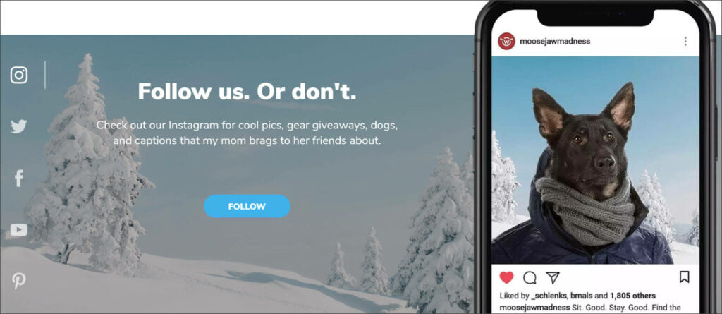
Moosejaw

MooseJaw

Moosejaw has built a loyal community in the crowded space of online outdoor outfitters. 

What works: A key ingredient in Moosjaw’s success is their playful, sometimes self-deprecating copy. Their request for us to follow them on instagram is on-brand. 

Plus, their imagery stops us in our tracks. Because dogs are awesome. And yes, that was a snow pun.

Tuckfest

Tuck Fest

The U.S. National Whitewater Center is a premier outdoor adventure facility in Charlotte, NC. Tuckfest is their yearly, multi-day festival that features dozens of activities, competitions, and live musical performances.

What works: Keeping track of all the events is difficult for visitors. The USNWC’s Tuckfest website uses intuitive navigation and multiple schedule views to make sure every activity is easy to find.

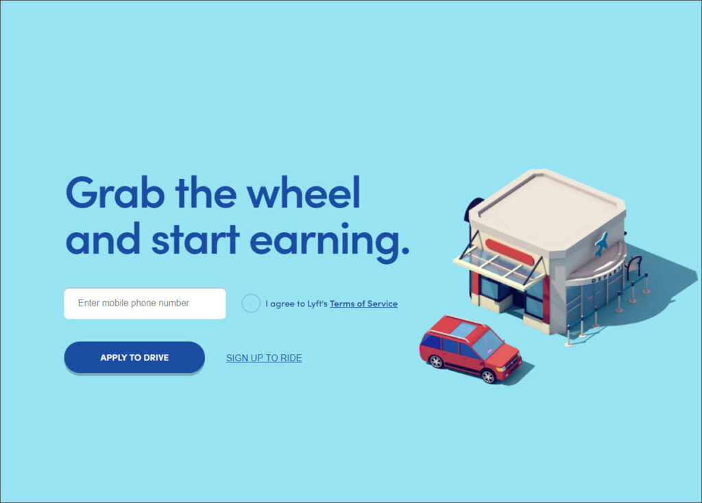
Lyft

Lyft

Lyft is one of the largest ride-share programs in the country. 

What works: Their copy is simple. Their call to actions are straightforward. And the ‘whitespace’ keeps visitors’ attention on the most important elements of the page.

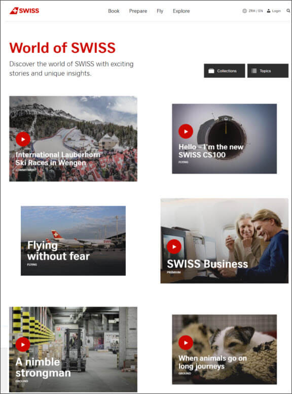
Swiss Airlines

Swiss Airlines

Swiss is the flag airline carrier of Switzerland with routes all over the world.

What works: Their blog, World of Swiss, is clean and easy to navigate. It’s filled with useful video and written articles that answer questions a traveler is likely to have.

(We love blogs on websites. Learn how a blog can help your business grow here)

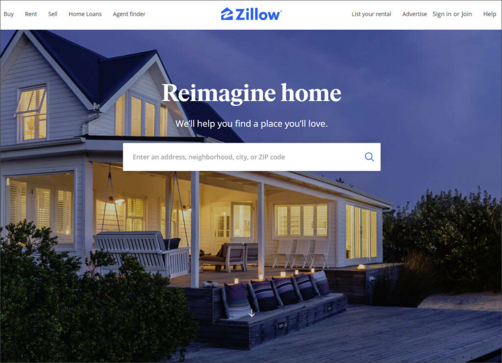
Zillow

Zillow.com is the most popular real estate discovery platforms in the U.S. with 36 million monthly visitors.

What works: Simplicity reigns on the Zillow landing page. The copy and the information bar make it easy to get right to the good stuff. Visitors immediately know what the site does and how they can do it. 

Of course, their background image is warm and inviting as well.

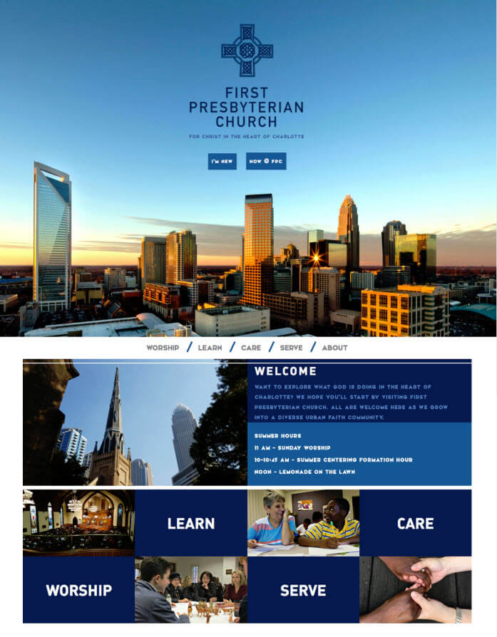
First Presbyterian Church

First Pres Charlotte

First Presbyterian Church is a welcoming congregation in the heart of Charlotte, NC. They keep a robust calendar of worship, outreach, and service initiatives.

What works: With so much information to share, it would be easy to clutter up the FPC landing page. Instead, they provide two simple buttons: ‘Welcome’ and ‘now @ FPC.’ This easy navigation is framed by a beautiful image of Charlotte’s skyline in the background, leaving an attractive and useful place for visitors to start.

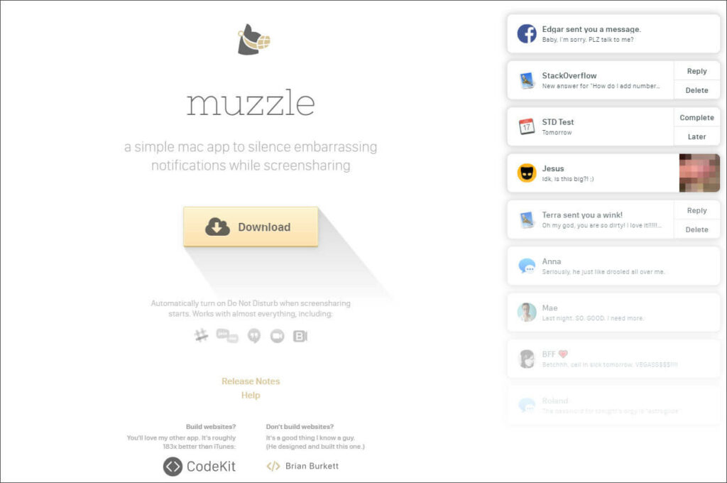
Muzzle App

Muzzle App

The Muzzle app allows you to silence notifications, avoiding some potentially awkward moments.

What works: One of the goals of a great website is to agitate a problem while providing the solution. Muzzle App does this brilliantly with a scrolling list of calendar and social media notifications that would be uncomfortable should, say, your mom happen to see them.

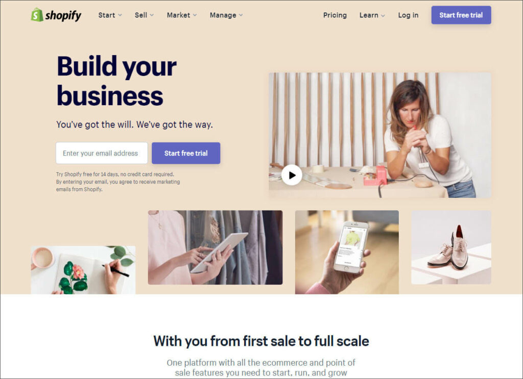
Shopify

Shopify

The Shopify ecommerce platform makes it easy for businesses to launch their online stores.

What works: Shopify’s landing page copy is some of the best out there. Their mission is clear right away: they exist to build your business.

From there, they make it clear that Shopify is the right platform for even the smallest business. 

Finally, their CTA offers a clear and safe path to move on to the next step.

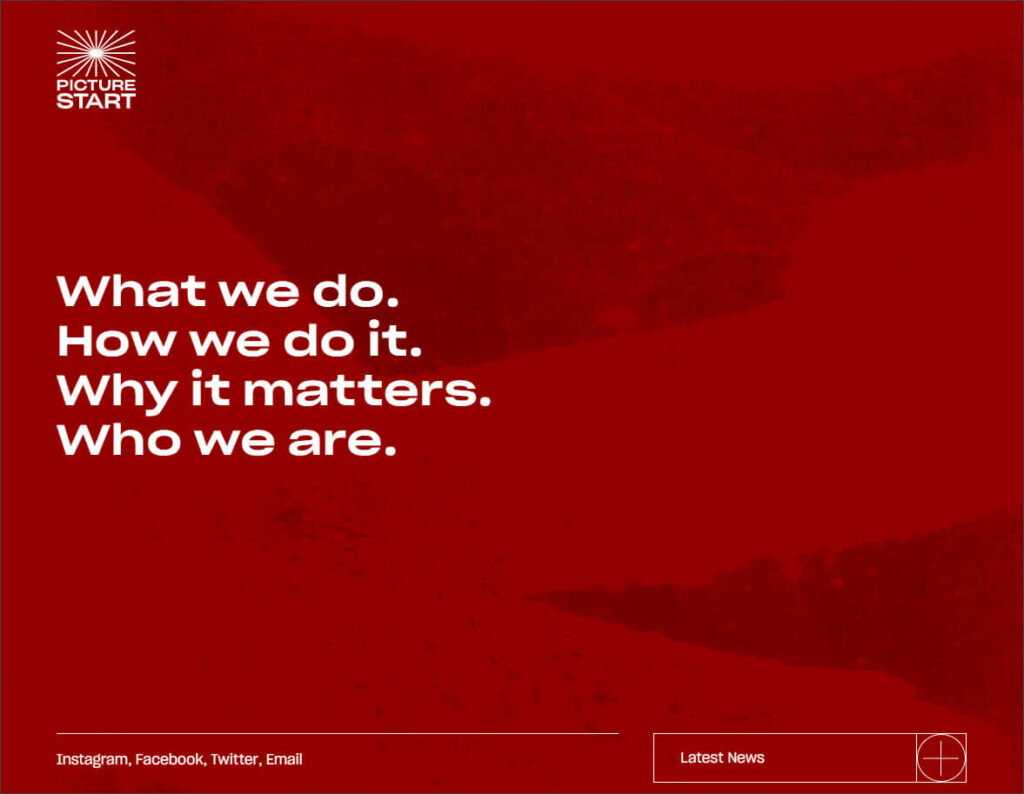
Picturestart

Picture Start

PIcturestart is a media company that creates, finances, and produces ‘discovery of voice’ content across multiple platforms.

What works: Picturestart proves that whitespace needn’t be white. Their background rotates through a series of bold colors, but each iteration allows their simple navigation to remain at the center of attention.

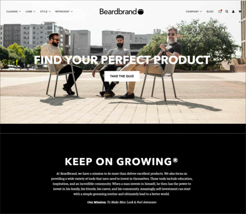
Beardbrand

Beard Brand

Beard Brand sells premium men’s grooming products.

What works: Branding is important for every business, but it’s doubly so for a lifestyle brand. Every element of the Breardbrand site— the images, the copy, even the navigation buttons— supports its mission to ‘Make Men Look & Feel Awesome.’ 

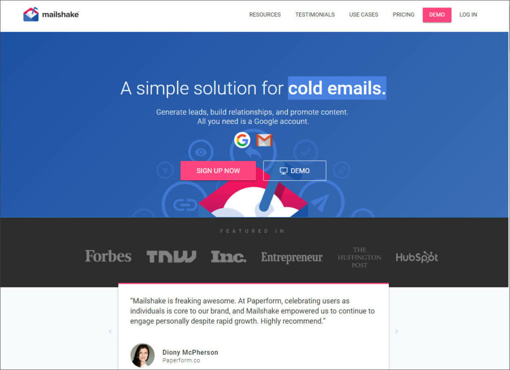
Mailshake

Mailshake

Mailshake provides software and services that help its clients automate and personalize email outreach. 

What works: Mailshake places powerful social proof prominently on their landing page. Both the customer quote and the ‘featured in’ list of media outlets help position their solution as effective and useful. They’ve also nailed their benefit-first copy.

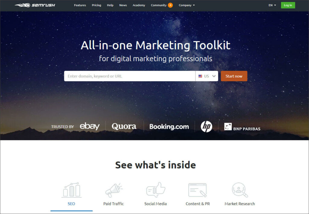
SEMrush

SEM Rush

SEMrush provides a host of SEO tools such as keyword research and SEO audits.

What works: Like Zillow, SEMrush has created a simplified user experience that makes it really easy to use their most popular tool. They’ve also included five icons at the bottom so visitors can take a quick tour of the product.

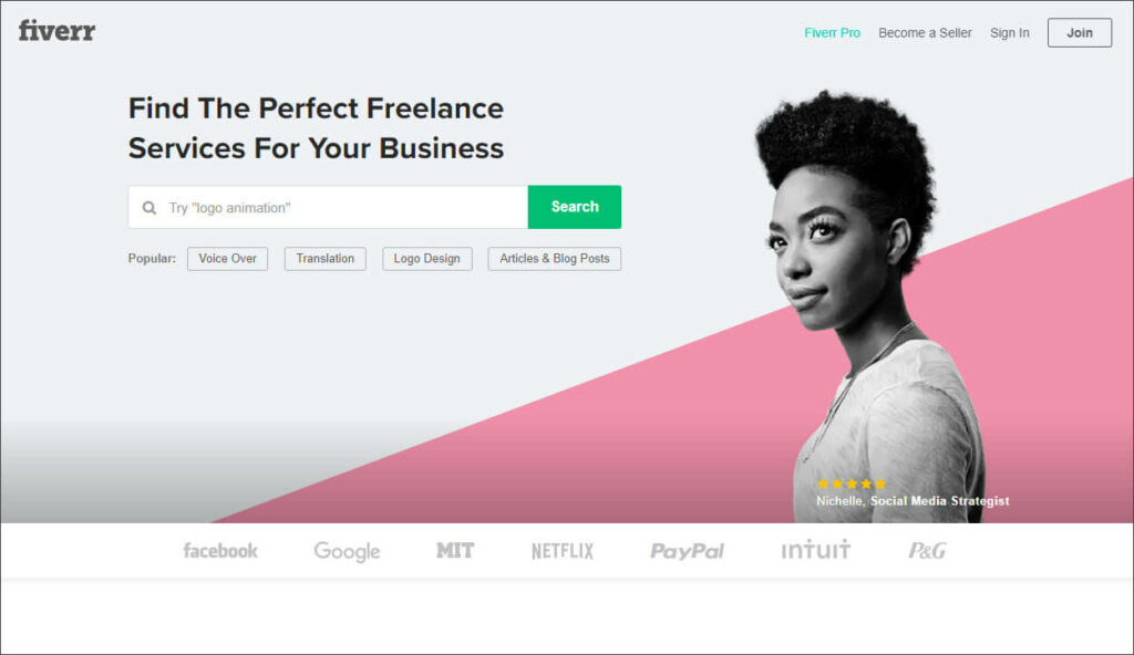
Fiverr

Fiverr

Fiverr has been the marketplace for freelance services since 2010.

What works: Fiverr makes CTAs the most important element on their landing page by giving them their own bold, contrasting color. They also creatively used their image for some highly personal social proof.

Ahrefs

Ahrefs

Marketers use Ahrefs tools to understand how their competitors rank on SEO.

What works: Similar to Fivver, Ahrefs uses a bold color that contrasts with the rest of the page for their most important CTA. They also cleverly place social proof right next to that attention-getting feature.

Wokine

Wokine

Wokine is a digital agency and startup studio located in France.

What works: A bold use of contrasting color immediately sets the tone for this agency, which focuses on simple, modern design. Their minimalist menu might not work for some websites, but it feels on-brand for this one.

hims

forhims

Hims offers medical grade, subscription solutions for men’s well being. 

What works: hims’ copy tackles some tough subjects with kindness and optimism. Those words are supported by a clean design and an image that exudes health and life.

Houston’s Best Pet Sitters

Houston's Best Pet Sitters

Their name says it all. Houston’s Best Pet Sitters provides caring, in-home pet sitting services throughout Houston, TX.

What works: Great website design isn’t just for enterprise corporations. HBPS proves this by using large, bold images to grab attention, copy that addresses the emotional benefit of their service, and a simple-yet-strong color scheme to draw eyeballs to important CTAs.

We believe website design should be as individual as the brand it’s representing. That’s why we do everything— design, development, copy, content— in house. 

Contact us and let’s chat about building the website your brand deserves.

Why Website Copy is as Important as Design (and how to write it)

Sometimes, the job of writing copy takes a backseat to website design. 

Maybe it’s because they’re often completed by a different set of professionals. Or maybe it’s because website design feels like the structure and copy more like the decoration, to be hung and placed only after the site is built. 

But when it comes to the job of attracting visitors to your business and converting them to customers, copy is equally important as color schemes and button placement. 

That’s why we believe the best websites have considered copy and design in equal measure. (It’s also why we offer both design and copywriting services in-house). 

Here are five reasons why copy is as important as design and five tips you can apply to your own website copy.

Why website copy is as important as design

1. Copy Sells

Excellent design makes people look. It can divert precious attention from the thousand other things fighting for it. 

But it can rarely sell. 

At least not on it’s own. Copy will educate your audience. It will help them understand why they have the pain they do and tell them how you can fix it. 

2. Copy filters your audience

It would be great if every person attracted by an image on your site was an ideal customer ready to buy. 

Unfortunately, they are not. 

When done right, website copy will quickly tell your visitors that this is the place for them. Or that it’s not.

In short, your copy qualifies website traffic so only the right people enter your sales funnel. 

3. Copy converts

What do you want someone to do next? Set up a call? Read another article? Register for your webinar?

A call to action (CTA) directly invites your audience to take these steps. 

It might just be the most important part of any webpage. And it’s driven by good copy.

4. Copy explains your unique value

The value you provide your customers is unique. You solve their problems faster, or cheaper, or in ways they’ve never even dreamed of.

Copy is what exposes your superpowers to the people that benefit from them the most.  

5. Copy establishes your brand voice

Ever been to a website and just felt comfortable? Like, these are my people. 

When it’s written with the reader in mind, website copy will establish your brand voice. And your ideal customer will become part of your community.  

How to write website copy that converts

There are shelves of books and thousands of articles written on the topic of conversion copywriting. We can’t cover it all in one post.

But we can provide a five-point checklist. Run your copy through these action points and your site will be converting like crazy. 

1. Be clear. Then be concise. Then be clever. And then you’ll be persuasive.

It’s easy to get caught up writing alliterative three-word phrases that sound really cool. But if your landing page copy is clever at the expense of clarity, people won’t know what you do and you’ll lose sales.

When reviewing your copy, remember these rules:

  1. Copy should be clear
  2. Copy should be concise as long as it’s still clear
  3. Copy should be clever but only if it’s still concise and clear 

2. Increase conversions with a clear, safe call to action

Whether you’re selling paper towels or enterprise accounting software, your customers will go through a journey on your website.

Your CTAs are how you invite them to the next stage of that journey.

There are two things your customers need from those CTAs:

  • They need to know exactly what will happen when they take action
  • They need to know it’s safe to take the next step

Let’s say you sell that accounting software and you offer a free trial.

Your CTA copy could state ‘start your free trial now.’

But that’s not terribly specific nor does it satisfy the human requirement for safety.

Instead, you might try ‘start your 14-day trial now. No credit card needed.’

Now I know exactly what I’m getting and I feel safe taking the next step.

3. Make a strong first impression by answering these three questions immediately

Within a few seconds, a new visitor to your website should know:

  1. What you do
  2. Who you do it for
  3. What they’ll get

A very simple and effective way to do this on your landing page is with a statement like this:

We (what you do) for (who) so they (the emotional benefit)

Here’s an example:

We plan estates for high wealth investors so they know their families are cared for in any event.

4. To keep your reader’s attention, make it all about them

You’ve poured sweat and tears into creating a product that’s so much better than anything else on the market. You want to shout its features from the rooftops!

But there’s a harsh reality: your website visitors probably don’t care. 

What they do care about is how all your hard work will make their lives better. If your copy tells them that, they’ll buy.

5. Become super relevant to your ideal customer by following the ‘rule of one’ 

In copywriting, the ‘rule of one’ means you focus on:

  • One reader
  • One idea
  • One promise
  • One offer

This narrow focus may feel a bit weird at first. Afterall, you want to sell to a lot of people. The choice here is to be very relevant to one specific audience, or irrelevant to them all. 

If you have several diverse audiences, create landing pages and popups with copy that appeals to each. 

****

Your website copy keeps the attention your design has attracted. It qualifies site visitors and converts them to customers. And it tells your audience that you understand their pain and have a solution for it. 
Writing website copy is part art and part science and can take years to master. Even so, there are a few simple rules that will put you in front of most of your competitors.

Even better, schedule a call with us before you start your next website design, or redesign, project. Our in-house copywriters will help you turn vision to voice and concept to conversions. Whether we’re designing your website or not.

Rock House Events Has a New Website That’s Ready for Summer Fun

Charlotte party planner, Rich Saner, knows how to throws great parties. He’s been hosting big bashes for over 15 years now through his brands Rock House and Rich & Bennett.

Bellaworks loves working with Saner and has designed websites for both of
his brands.  Recently, we launched a new website for Rock House, and we are excited about how it turned out.

Saner’s core audience is young professionals, who use the internet for
everything. They expect a quick and seamless experience on a website. Saner understands this and knows how important his websites are to his business and customers.

Bellaworks connects with Rich’s preference for a very clean look, super
intuitive and easy navigation, vibrant use of icons, and a general “don’t
make me think” approach. These websites are built to sell and convert and
have all of the tools ready to do so.

If you’re looking for some fun, you know who has you covered. Check out all the incredible events that Rock House and Rich & Bennett are offering.
Need a fresh website for your company? Let’s talk about your business
and how a new website can help you reach your goals.


Here are 5 Reasons Your B2B SEO Strategy Needs a Blog

You’ve just launched your new website. It’s a beauty! Responsive, mobile-friendly, clear calls to action.

And boy is it set up for SEO. The site maps are up, tags in place, and keywords thoughtfully peppered through each title. Your work is done.

Or is it?

The reality is that technical SEO on your website is just step one if you hope to rank high in search results.

Step two is launching your blog. Why? Because many of the factors Google considers most important for page ranking are influenced by a blog more than by technical SEO.

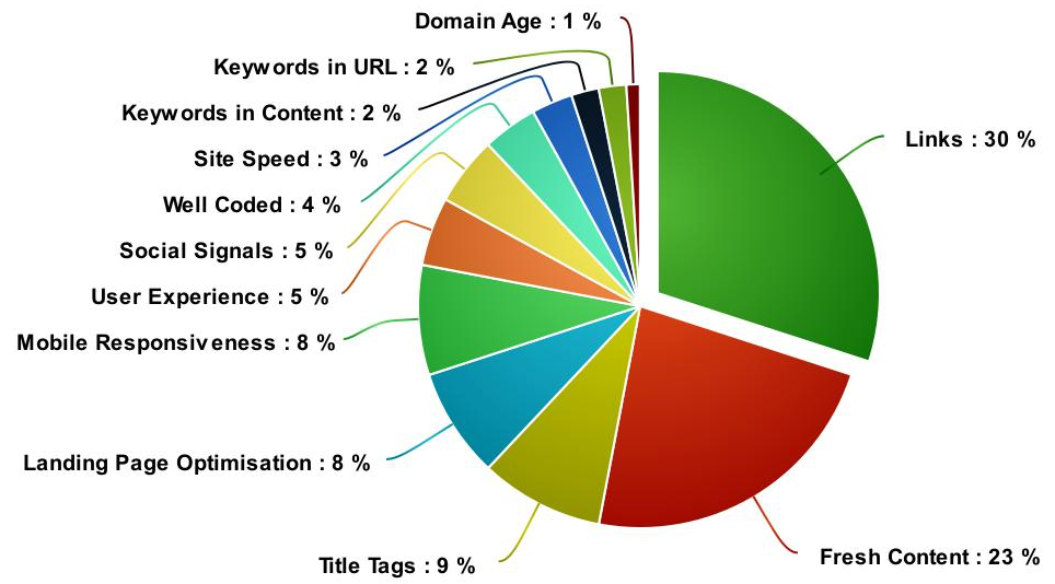
Consider this chart of Google ranking factor influence from Quick Sprout:

Links and fresh content alone account for over 50%. These are things you’ll be chasing long after your website is launched.
They’re also things a blog is really good at. Actually, there are several ranking factors a blog can help with. We’ve gathered up five ways a blog will help your new website land high up on search engine results pages.
But before we get into how a blog helps with SEO, let’s get two things straight:

  1. Google will probably never buy anything from you.
  2. Google’s aim is to make sure its users find good answers quickly and efficiently.

What’s this mean to us?

Any SEO strategy, including blogging, should be done first and foremost for the humans that use Google, not for an algorithm. If you’re helping Google help their users, they’ll reward you with higher search page placement.

With that in mind, let’s look at five ways a blog can help you achieve better rankings on Google.

1. A blog increases backlink and internal link potential

According to the chart we shared, links to your site have a huge influence over page ranking.

There are two kinds of links to consider. Just in case these terms are new to you:

  • Internal links are when you link from one page of your website to another page of your website.
  • Backlinks are inbound links from other websites to yours.

Google loves both.

Internal links help the Google bot understand your site structure and how pieces of content are related. They show your authority on a particular topic.

Some internal links are considered more valuable by Google, and the whole internal link strategy can get pretty deep. Generally speaking, though, more links are good. And publishing new blog content gives you lots of opportunities to link to pages throughout your site.

Backlinks are even more powerful. When Google sees backlinks to your site, especially from a popular, high-authority website, it assumes your site is also trustworthy.

“Backlinks are especially valuable for SEO because they represent a ‘vote of confidence’ from one site to another.”
Moz.com

Getting those high-authority sites backlinking to yours can be tough. But publish a great article about an important topic and those site owners gladly do it (kind of like the Moz article we just linked to).

2. A blog keeps your website fresh

Google wants to make sure its users are getting up-to-date answers to their questions. So they give priority to websites that are updated often.

It would be awkward, and unwise, to change your landing page copy twice a week. Publishing fresh content to your blog is a much better way to show Google your website is tended to and updated.

Publishing new content is also a trigger for Google’s web crawlers to index your site more often. This doesn’t help you climb the rankings on its own. Your content has to be good, as judged by your audience.

3. Good content improves traffic and dwell time on your site

This one is pretty simple.

Google wants to know that your site is good at answering questions.

How do they know? By how your audience interacts with your website.

If lots of people visit your site (traffic), stick around awhile (dwell time), and continue past the first page they hit (bounce rate), Google will know that your site is useful to its users.

When you publish great blog posts that answer questions well, all that will happen.

“Focus on ‘dwell time’ (how long site visitors spend with your content), rather than vanity metrics like pageviews. Creating quality content is extremely important because Google cares about how deep people navigate into your site, whether they hit the back button, and worst of all, whether they return to the search results page because they didn’t find the information they were looking for.”
John Lister, Strategist at Elite SEM

4. A blog helps you rank for keywords

When many people think SEO, this is often what comes to mind. Having words on your site that match what people search for on Google increases your chance of ranking high on search pages.

No dirty tricks, though.

Gone are the days of adding hidden pages full of keywords you want to rank for (also called ‘keyword stuffing’). Google is hip to that trick, and most other ‘black hat’ SEO tactics.

But there are only so many opportunities to organically use keywords on your landing pages. So how do you increase the frequency of keywords on your site without being shady?

Content!

Yep, publish content on the topics you want to rank for. Let’s say you run a staffing business and are launching a new employee retention and training product for small businesses. You want to show up on searches like “How can I reduce employee churn?”

So you publish an article called “Reduce Employee Churn with these 10 tips.”

Then, use that term organically throughout the post— especially in your headers and first and last paragraphs.

5. A blog improves your website’s social signals

Like bounce rate and traffic, Google uses social signals to decide if your site is valuable to its users.

Social signals are likes, shares, retweets, and comments on your social media posts.

So, how do I post things that will get more of these social signals?

Before you post anything, consider people’s intent, or mindset, while they’re on social media. It’s different than when they’re using a search engine.

Here’s what we mean.

On search engines, people are looking for information to solve problems and make decisions.

On social media, they’re hanging out with friends, catching up with relatives, and watching funny videos. In short, they’re avoiding making decisions.

Think of it this way. You’re having a drink with your friends at your favorite watering hole, talking about cars. A salesperson walks up, interrupts your conversation, and starts telling you how awesome his car dealership is and why you should buy a new Toyota.

Yuck! (no offence to Toyotas. They’re fine cars)

That’s how an overabundance of product ads can feel on social media.

Instead of interrupting the conversation, join it.

Your blog posts, the ones that offered really helpful information, are the perfect way to do it. Target people that love cars who live in Denver and publish a paid post to Facebook about the 10 best auto shows in Colorado.

Not only will you gather social signals, but you’ll establish your business as a helpful resource to your target audience.


Great website design is a critical first step in ranking well on search engine results pages. But the work doesn’t stop there.

A B2B blog is the next best step in a successful SEO strategy. Its benefits for the most influential search engine ranking factors are long-term and compounding.

But for it to work, that content needs to be good.

Great news! We can help. You can start by downloading our guide on content that converts.

Even better, contact us and we’ll help you launch a blog that drives traffic, generates leads, and grows sales. Yep, we do that!