
Your website is your storefront.
It’s the one place online you have total control over the impression you give your audience.
If it isn’t designed to grab their attention, educate them quickly, and move them through your sales funnel, it could cost you sales.
But great website design isn’t just about color palates and whitespace (although they’re important). The copy, ease of navigation, and consistency with your brand are all important, too.
In fact, there are a number of characteristics you’ll want to keep in mind when you’re designing, or redesigning, your website, such as:
- Clear, safe calls to action
- Strong visual features that attract attention without distracting from the purpose
- Consistency in branding
- User-focused conversion copy
- Color pallet that concentrates attention on the most important elements
- Blog with helpful content
- Intuitive navigation
Seeing is believing, so we’ve curated 17 examples of websites we love to inspire your next website design.
Problogger
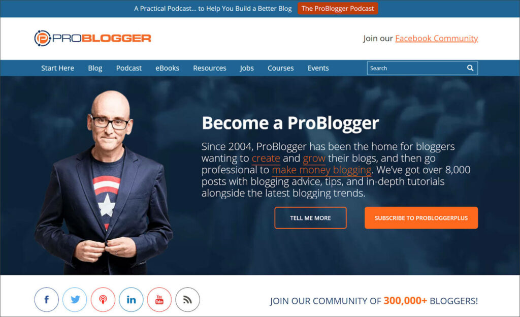
ProBlogger offers a ton of educational resources for writers and professional bloggers.
What works: There’s a lot to like about ProBlogger’s landing page. What we really love is the contrasting color they use to highlight their most important elements. Your eye is immediately drawn to their ‘subscribe button.’ Then it floats down to their impressive community of 300k members.
Moosejaw
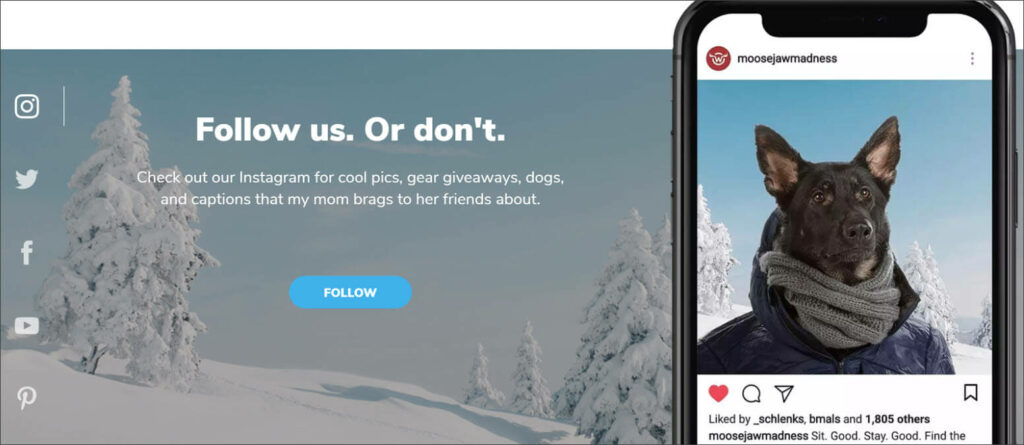
Moosejaw has built a loyal community in the crowded space of online outdoor outfitters.
What works: A key ingredient in Moosjaw’s success is their playful, sometimes self-deprecating copy. Their request for us to follow them on instagram is on-brand.
Plus, their imagery stops us in our tracks. Because dogs are awesome. And yes, that was a snow pun.
Tuckfest
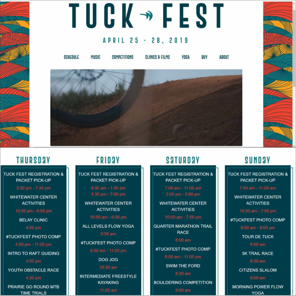
The U.S. National Whitewater Center is a premier outdoor adventure facility in Charlotte, NC. Tuckfest is their yearly, multi-day festival that features dozens of activities, competitions, and live musical performances.
What works: Keeping track of all the events is difficult for visitors. The USNWC’s Tuckfest website uses intuitive navigation and multiple schedule views to make sure every activity is easy to find.
Lyft
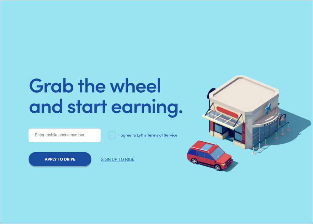
Lyft is one of the largest ride-share programs in the country.
What works: Their copy is simple. Their call to actions are straightforward. And the ‘whitespace’ keeps visitors’ attention on the most important elements of the page.
Swiss Airlines
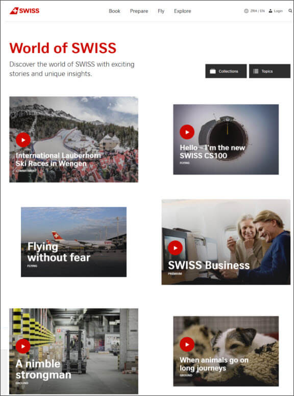
Swiss is the flag airline carrier of Switzerland with routes all over the world.
What works: Their blog, World of Swiss, is clean and easy to navigate. It’s filled with useful video and written articles that answer questions a traveler is likely to have.
(We love blogs on websites. Learn how a blog can help your business grow here)
Zillow
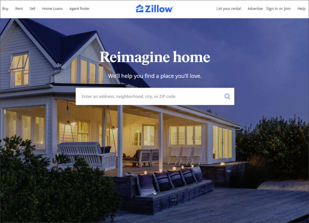
Zillow.com is the most popular real estate discovery platforms in the U.S. with 36 million monthly visitors.
What works: Simplicity reigns on the Zillow landing page. The copy and the information bar make it easy to get right to the good stuff. Visitors immediately know what the site does and how they can do it.
Of course, their background image is warm and inviting as well.
First Presbyterian Church
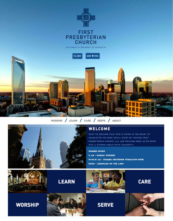
First Presbyterian Church is a welcoming congregation in the heart of Charlotte, NC. They keep a robust calendar of worship, outreach, and service initiatives.
What works: With so much information to share, it would be easy to clutter up the FPC landing page. Instead, they provide two simple buttons: ‘Welcome’ and ‘now @ FPC.’ This easy navigation is framed by a beautiful image of Charlotte’s skyline in the background, leaving an attractive and useful place for visitors to start.
Muzzle App
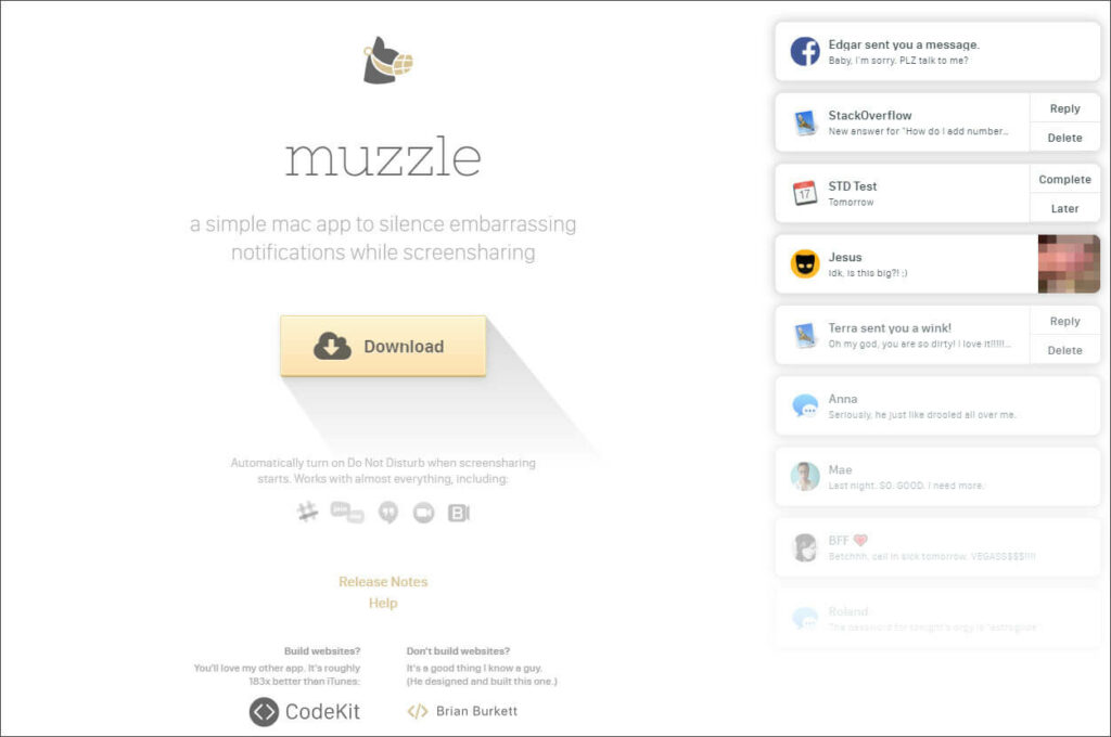
The Muzzle app allows you to silence notifications, avoiding some potentially awkward moments.
What works: One of the goals of a great website is to agitate a problem while providing the solution. Muzzle App does this brilliantly with a scrolling list of calendar and social media notifications that would be uncomfortable should, say, your mom happen to see them.
Shopify
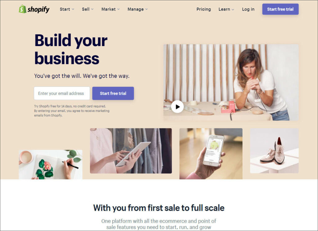
The Shopify ecommerce platform makes it easy for businesses to launch their online stores.
What works: Shopify’s landing page copy is some of the best out there. Their mission is clear right away: they exist to build your business.
From there, they make it clear that Shopify is the right platform for even the smallest business.
Finally, their CTA offers a clear and safe path to move on to the next step.
Picturestart
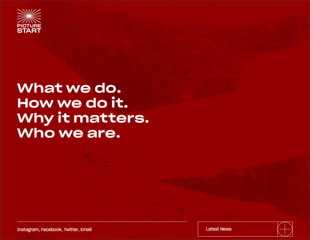
PIcturestart is a media company that creates, finances, and produces ‘discovery of voice’ content across multiple platforms.
What works: Picturestart proves that whitespace needn’t be white. Their background rotates through a series of bold colors, but each iteration allows their simple navigation to remain at the center of attention.
Beardbrand
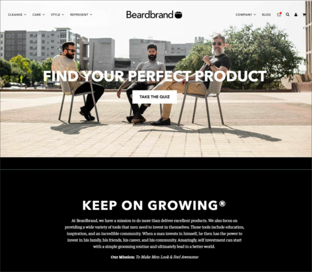
Beard Brand sells premium men’s grooming products.
What works: Branding is important for every business, but it’s doubly so for a lifestyle brand. Every element of the Breardbrand site— the images, the copy, even the navigation buttons— supports its mission to ‘Make Men Look & Feel Awesome.’
Mailshake
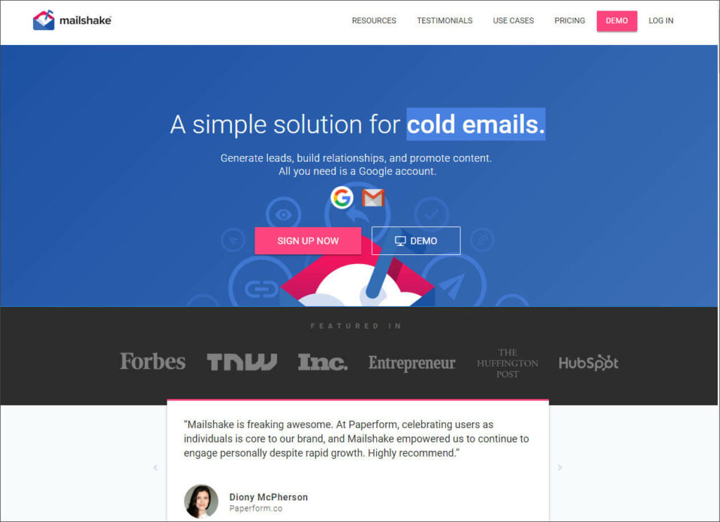
Mailshake provides software and services that help its clients automate and personalize email outreach.
What works: Mailshake places powerful social proof prominently on their landing page. Both the customer quote and the ‘featured in’ list of media outlets help position their solution as effective and useful. They’ve also nailed their benefit-first copy.
SEMrush
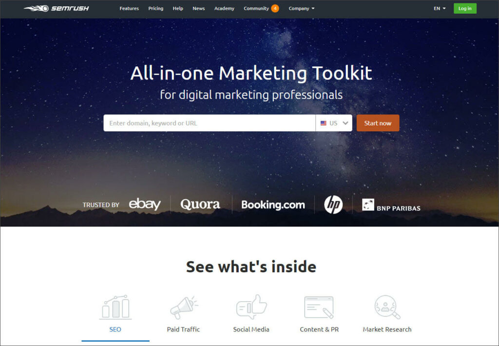
SEMrush provides a host of SEO tools such as keyword research and SEO audits.
What works: Like Zillow, SEMrush has created a simplified user experience that makes it really easy to use their most popular tool. They’ve also included five icons at the bottom so visitors can take a quick tour of the product.
Fiverr
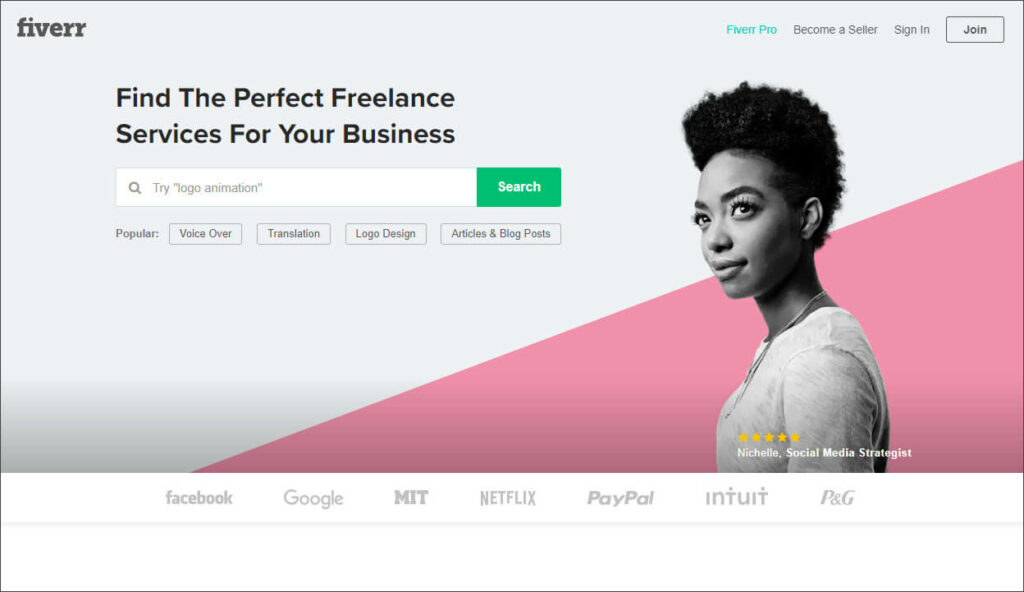
Fiverr has been the marketplace for freelance services since 2010.
What works: Fiverr makes CTAs the most important element on their landing page by giving them their own bold, contrasting color. They also creatively used their image for some highly personal social proof.
Ahrefs
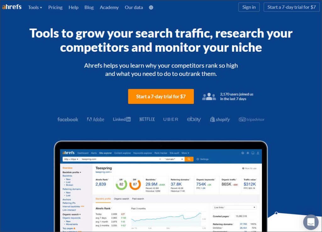
Marketers use Ahrefs tools to understand how their competitors rank on SEO.
What works: Similar to Fivver, Ahrefs uses a bold color that contrasts with the rest of the page for their most important CTA. They also cleverly place social proof right next to that attention-getting feature.
Wokine
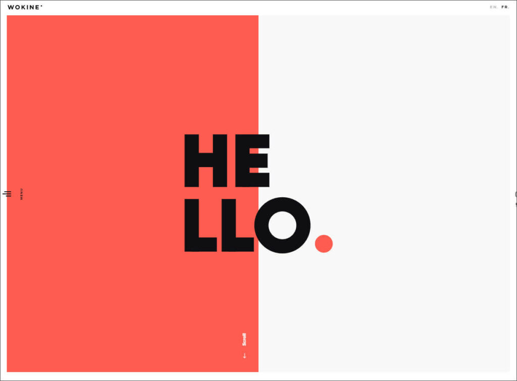
Wokine is a digital agency and startup studio located in France.
What works: A bold use of contrasting color immediately sets the tone for this agency, which focuses on simple, modern design. Their minimalist menu might not work for some websites, but it feels on-brand for this one.
hims
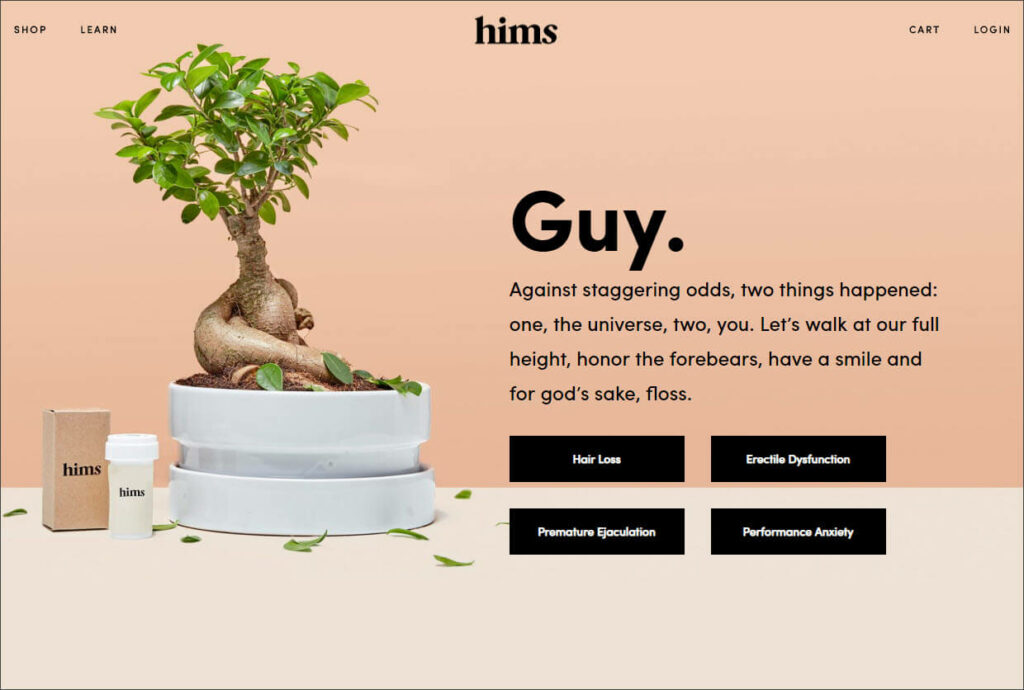
Hims offers medical grade, subscription solutions for men’s well being.
What works: hims’ copy tackles some tough subjects with kindness and optimism. Those words are supported by a clean design and an image that exudes health and life.
Houston’s Best Pet Sitters
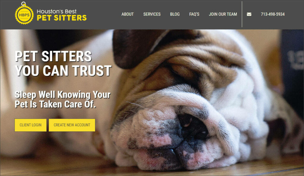
Their name says it all. Houston’s Best Pet Sitters provides caring, in-home pet sitting services throughout Houston, TX.
What works: Great website design isn’t just for enterprise corporations. HBPS proves this by using large, bold images to grab attention, copy that addresses the emotional benefit of their service, and a simple-yet-strong color scheme to draw eyeballs to important CTAs.
We believe website design should be as individual as the brand it’s representing. That’s why we do everything— design, development, copy, content— in house.
Contact us and let’s chat about building the website your brand deserves.