With the speed at which technology evolves and trends come and go, staying on top of your website updates is crucial to your online success. If you’ve recently undergone significant brand changes, want to reach new business goals, or have a site that simply looks a little out of date – it may be time to redesign your website. Let’s take a look at how a website refresh can benefit your business through the story of one of our recent clients: the U.S. National Whitewater Center in Charlotte, NC.
When do you need to refresh your website?
When we talk about refreshing a website, there are two approaches to consider: consistent web maintenance and small updates, or a major overhaul that includes design and structural change. Maintenance and app updates should happen frequently, and we recommend revisiting your website and making smaller-scale updates about once a year. If it’s been 3-5 years since you’ve made any significant changes to your site, you may want to consider a redesign. When you redesign your website, you’ll have the opportunity to keep things you love, update areas that can make your business appear out-of-touch to tech-savvy visitors, and ensure that your site truly represents your brand.
The U.S. National Whitewater Center (USNWC – now Whitewater) came to us with a unique challenge: they needed to both improve user experience on their site with a redesign and change their URL without losing traffic. As their long-time web builder and consultant, we dove right in!
How a website redesign can improve UX
Great websites encourage users to move through pages intuitively and seamlessly. As your business grows or changes and technology improves, a website redesign can be the answer to creating an outstanding user experience (UX) that drives conversions.
The whitewater center was facing these challenges with their existing website:
- Difficult navigation
- Too much text & dense information
- Time-consuming manual input requirements
- Outdated brand look & voice
Overall, our team saw the need to make information easier to find, better guide the user through a clear journey to conversion, and eliminate clunky workflows that required daily manual entry from staff. Plus, the brand was ready to update its website’s look and tone to match its level of professionalism and create a clearer connection to its mission of getting people outdoors. Learn more about what goes into refreshing a brand in this post.
UX & brand solutions from Bellaworks
We got to work eliminating these pain points and implementing strategies to elevate UX and align the new website with the brand’s goals. We focused on the elements below to achieve ideal results for this outdoor Charlotte staple, and successfully transitioned their site to its new URL: whitewater.org.
Creating an intuitive journey
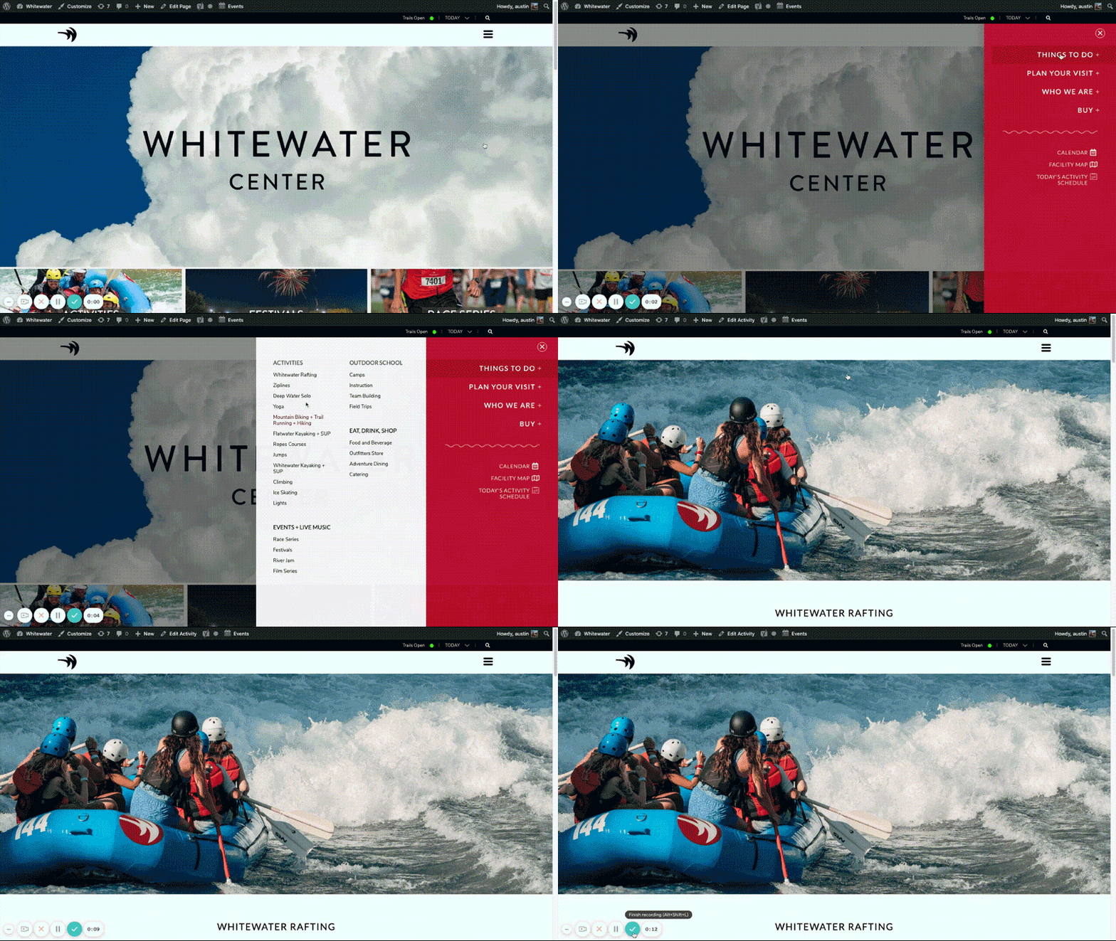
User experience is all about effortlessly moving visitors from Point A to Point B, anticipating their questions, and providing answers quickly and easily. We redesigned the whitewater center’s navigation to focus on guiding users from planning a trip to making a purchase without distractions or confusing steps. This included creating a super menu with key starting points, and nesting sub-navigation categories appropriately following those points.
Website design for scanning, not reading
Most web visitors will only spend a few seconds on each page, meaning the text on your website should be clear and digestible. Our team reconfigured page layouts to highlight the most important text and draw users’ attention to key information. By leveraging icons, bullets, expandable panels, and jump-to buttons, we were able to create a design that communicated ideas clearly and encouraged action.
Streamlining manual workflows
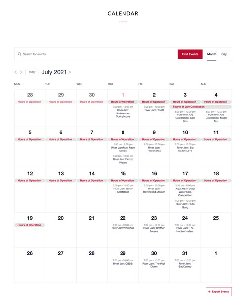
To address the issue of daily manual action required by whitewater center staff, we created a bulk calendar management system that eliminated the need for daily maintenance. Instead, the whitewater team could create and update their calendar on a monthly basis, and certain user roles were combined to streamline additional update processes.
Bolder branding for USNWC
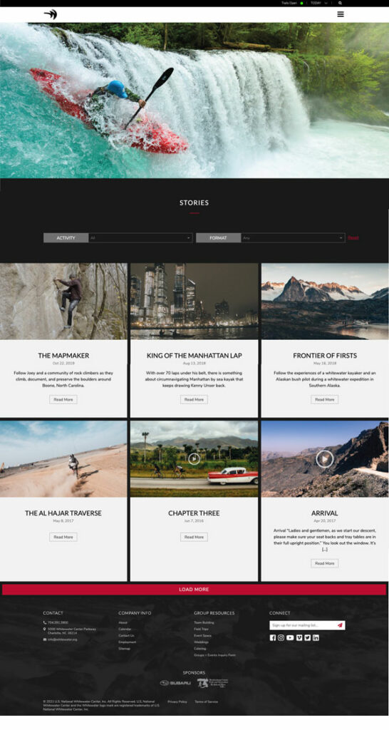
The whitewater center had already established a strong brand identity, and they wanted to explore how their website could better support and increase their brand equity. We incorporated their iconic brand mark throughout website pages to reinforce brand recognition and implemented a brand new “Stories” feature. This page would serve to showcase experiences by whitewater center guests and illustrate the benefits of making a purchase to site visitors.
Following our redesign, the USNWC saw an increase in sales and a reduction in hours spent entering and correcting data. They’re happy to share their new website with prospective clients and partners knowing that its appearance, function, and UX is in top shape.
What do you need to redesign a website?
As you can see, successfully redesigning a website to attract your ideal audience, promote a positive user experience, and reflect your brand’s values takes more than just one web designer or brand specialist. It takes a team of web experts who can create comprehensive digital solutions that equally consider your UX, design, security, and branding.
Take a look at our services to learn more about how we can help with your website redesign, and get in touch today to speak with a Bellaworks expert about your website goals.


